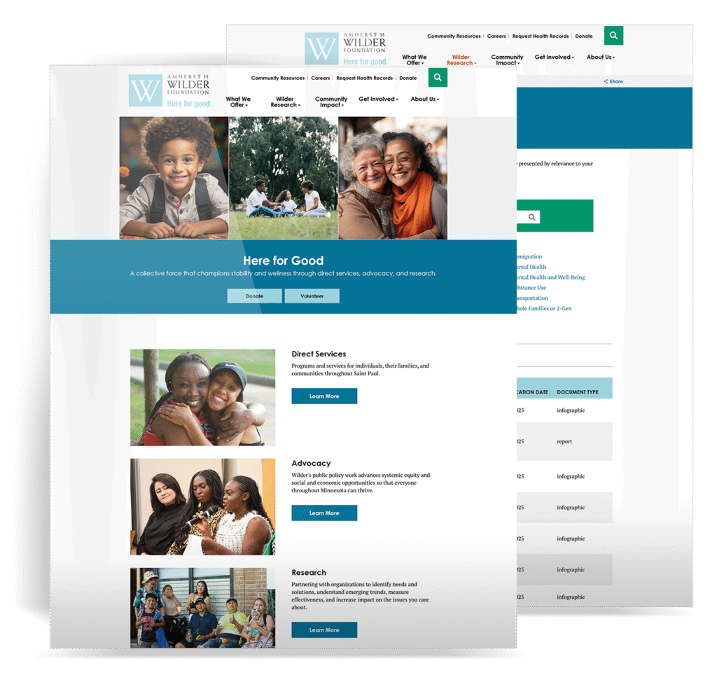
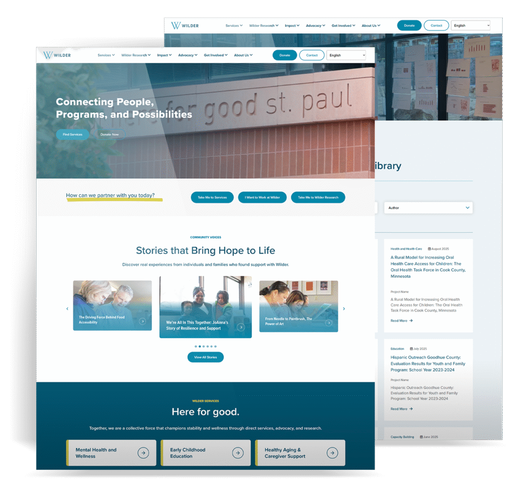
Scattered research → one library
Wilder
Visitor questionWhere do I go for help, research, or a way to act?
Next stepFind a service, resource, person, or way to help
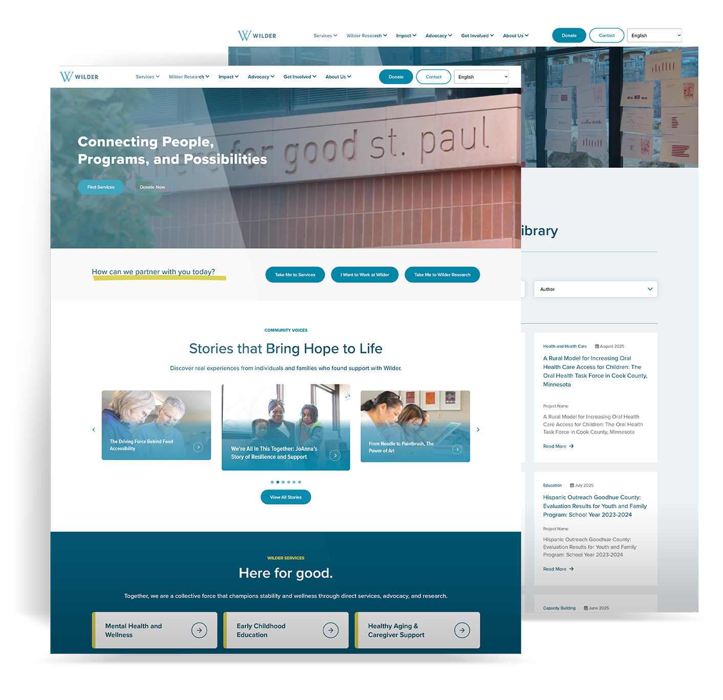
Wilder’s research was scattered, and its website made information hard to find. I redesigned and redeveloped the public site, migrated its Drupal content, and built a searchable Research Library with the data structure and custom code behind it.
I interviewed staff and users, reviewed behavior, and designed the user journeys, Figma wireframes, layouts, and components. I built the responsive WordPress site in HTML, CSS, JavaScript, and custom PHP, and connected the Research Library through XML, XPath, ACF, and API work.
01 People
Heavy menus and dense copy made thousands of pages hard to navigate. Research felt separate from the main site. I needed to change how people found information, not just move the same problems to WordPress.
I redesigned and redeveloped the public website, migrated it from Drupal to WordPress, and rebuilt the Research Library. My scope included the interface, content system, templates, and search.
I started with staff and user interviews, analytics, heatmaps, and a content audit. I used that work to map visitor needs, present the direction to stakeholders, and guide the design through migration and launch.
The question behind the redesign
Can people find their next step without learning how Wilder is organized?
I compared visitor behavior with staff knowledge and the content audit. That connected problems in the public pages to the content and maintenance work behind them.
I compared the questions people asked with Wilder’s internal language to find where the two stopped matching.
I reviewed entry points, next pages, exits, searches, devices, and paths to services, research, contact, volunteering, and giving.
I reviewed click attempts, scroll depth, and where attention stopped, including friction on phones.
I mapped repeated content, outdated paths, naming conflicts, page types, and editor needs before migration.
Who I spoke with
I spoke with stakeholders, staff, and users to understand what they needed from the website.
Wilder’s goals, priorities, and what needed to be on the site.
Common questions, internal language, and the content the team maintained.
What people needed to find and where the path became unclear.
I compared those needs with analytics, heatmaps, and the content audit, then shaped the site around the findings.
Someone seeking help, someone finding a report, and someone offering support were not making the same journey. Editors also needed a way to maintain those paths.
They may be stressed, unsure of the terminology, and searching on a phone. The next step needs to be clear.
Needs to know: Where do I go, and what happens next?
They need reports, authors, topics, evidence, and partnership information without navigating a separate database.
Needs to know: Can I find the right research and understand how it connects?
They need to understand Wilder’s work and find a direct way to give, volunteer, or advocate.
Needs to know: Where can I help, and why does it matter?
They need repeatable page patterns they can update without rebuilding layouts or restoring the old sprawl.
Needs to know: Can I keep this current without breaking the system?
02 Design
I organized navigation around finding help, research, or a way to get involved. I mapped the questions along each path, then designed the Figma wireframes, visual system, page layouts, and responsive components.
Services, research, partnerships, giving, volunteering, or Wilder’s story.
Choose a task-based label, not an internal program name.
Plain language and a clear reading order.
Stories, research, details, and expectations near the decision.
Find help, request an appointment, read, contact, give, or volunteer.
Wireframe logic
I used Figma wireframes to decide what came first, what context followed, and where someone could act. This representative wireframe is rebuilt for the case study, not an original working file.
I brought services and support forward, placed stories and focused choices after them, and gave the page a clear final action. On mobile, I reconsidered that order rather than shrinking the desktop layout.
The design question: what does this person need to decide next?
Navigation labels set the direction. Typography, spacing, cards, and actions carried it through services, stories, research, and ways to get involved.
Navigation and page openings answered the visitor’s question before explaining Wilder’s structure.
I used typography, spacing, cards, and primary actions to give each page a clear reading order and next step.
I changed navigation, section order, reading length, and tap targets for phones.
I designed shared templates, cards, story blocks, research results, and action patterns. Structured fields let editors update the content without rebuilding the layout.
Before the rebuild · Homepage scroll map
The desktop scroll map shows less reach farther down the old homepage. In the redesign, I brought service and support choices forward.
Pre-rebuild capture only. Post-launch heatmaps are not included.
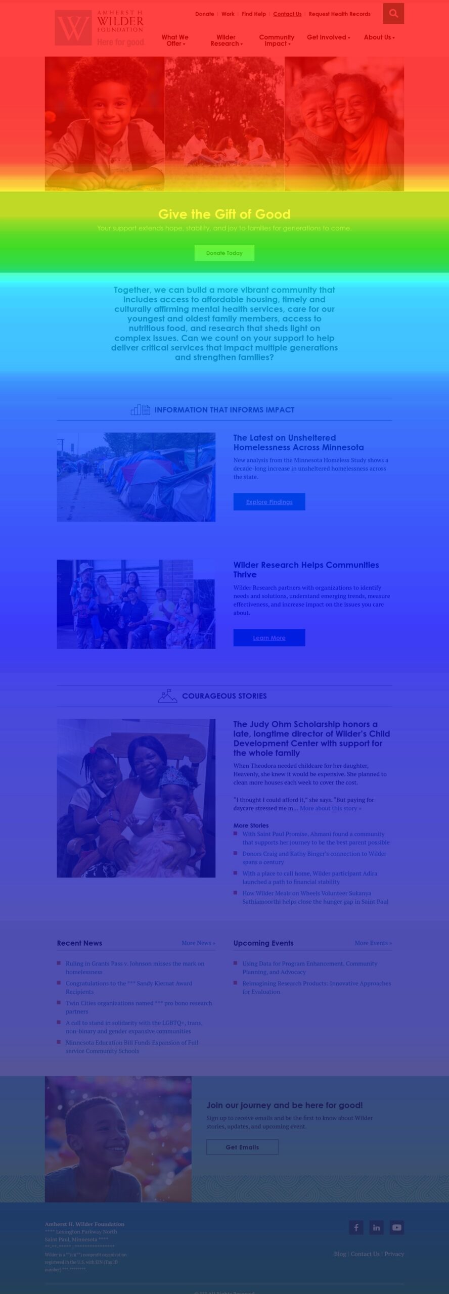
Desktop homepage · before the rebuildCropped preview. Open the full capture to inspect.
View full captureThe redesign brought services forward, clarified each page’s role, and connected the Research Library to the main site.
I kept Wilder’s depth while changing how people found their way through it.
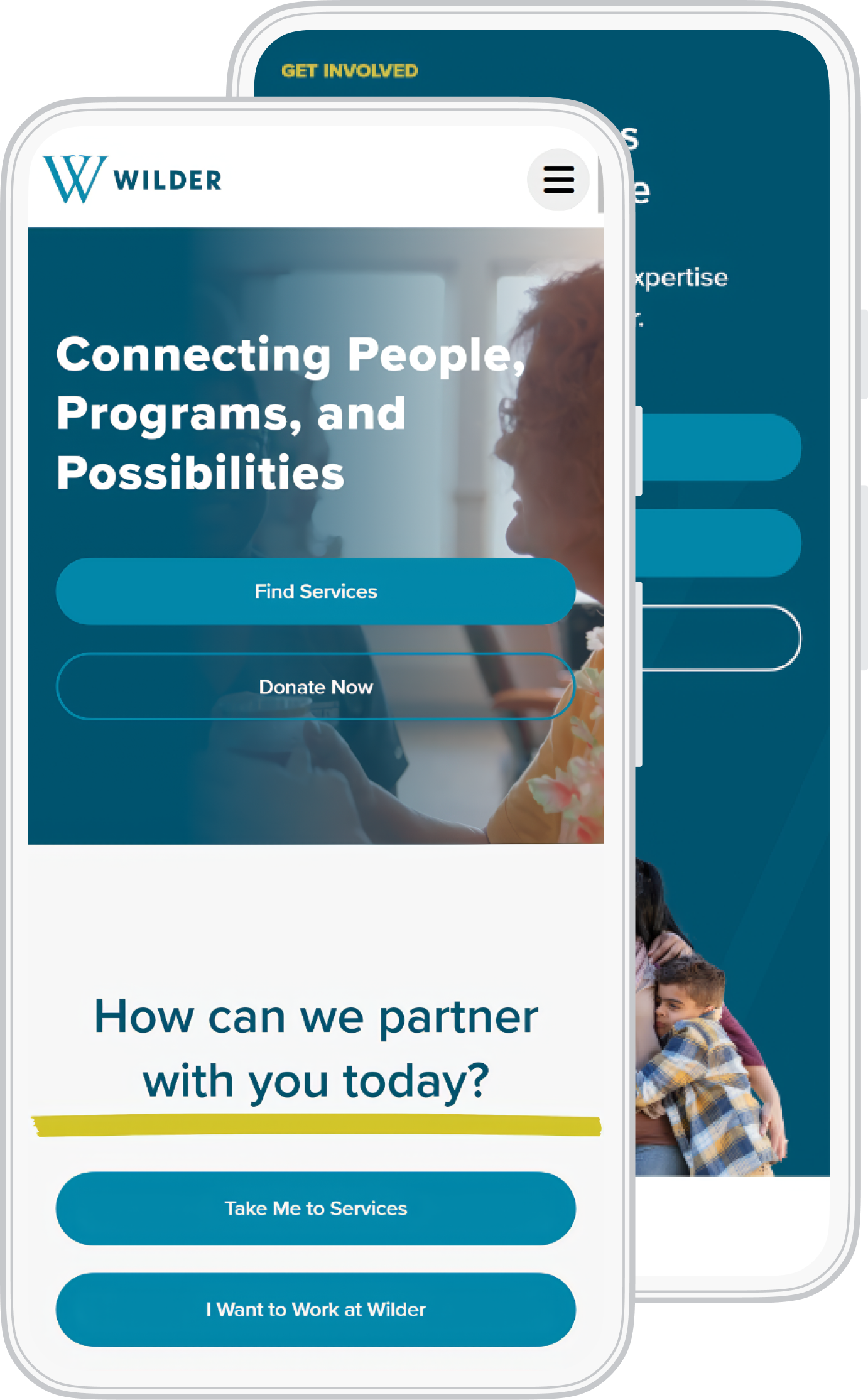
Mobile path
I designed the smaller-screen layouts separately: shorter openings, simpler navigation, more room to tap, and service and support choices earlier in the page.
03 Build
I defined page types, fields, categories, and relationships before migration. Then I built the WordPress theme, responsive components, and custom PHP functions, moved the Drupal content, and cleaned it for the new structure.
I connected the layouts to structured content and reusable behavior. The site had to work for visitors and for the staff updating it.
I built the page structure and responsive styles for my layouts, including headings, spacing, cards, images, and actions at different screen sizes.
I turned the interface patterns into reusable components and templates across services, programs, stories, events, staff, and research.
I connected templates, custom post types, taxonomies, and ACF fields. Custom PHP functions also handled research-data cleanup and mapping.
I built Elementor widgets and ACF field groups so staff could update content inside the layouts I designed.
I connected library search and filters to result updates without a full-page reload, and checked the empty and error states.
I tested responsive layouts, headings, contrast, images, forms, links, and search. I also handled metadata, performance work, and analytics checks.
I used the research and content audit to define page types, fields, categories, and relationships before migration.
I translated the layouts into reusable markup and responsive CSS for cards, stories, navigation, and calls to action.
I connected interactive controls, search selections, filters, and result updates, then checked their states in the browser.
I used custom PHP and WordPress functions to connect templates, content types, taxonomies, ACF fields, and data cleanup.
I built the theme, moved Drupal content, connected research data, and handled manual cleanup.
I checked mobile, search, filters, states, accessibility, links, forms, analytics, speed, and editor workflows.
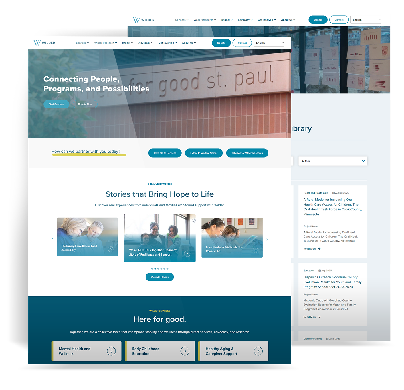
Design into code
I built the pages I designed, connected them to WordPress content and custom functions, and checked the migrated content in those layouts. The Research Library also needed its own search and data work.
04 Research Library
Presto held more than 1,000 records with PDFs, authors, dates, topics, clients, and studies. I redesigned and developed the library in WordPress, turning that uneven data into one searchable experience.
I designed the path from a keyword or filter to a result, a report page, and a PDF. Result cards, related details, and empty and error states kept that journey within Wilder.org.
I modeled, imported, and cleaned the records. Custom PHP connected fields and relationships. JavaScript and AJAX updated search results without a full-page reload.
Presto and XML supplied reports, files, dates, authors, topics, clients, and study links.
XPath selected public records by field name, not a position that could change.
Custom functions cleaned dates, filenames, PDF paths, authors, categories, and metadata.
ACF fields, categories, studies, client organizations, topics, and files linked to the right posts.
AJAX search and filters updated results without a full-page reload.
{PropertyValues/PropertyValue[@name="Public document"]/text()} = yes
This field-name check selected only records marked public, rather than relying on a numbered position.
The import ran past record 1,000. I built rules for updates, cleanup, and relationships so later imports could update existing reports without duplicating them or spreading mapping errors.
Abstracts, report IDs, page counts, descriptions, excerpts, dates, social images, PDFs, and study links mapped into one model.
I fixed dates, timezones, and PDF paths, created or reused attachments, and checked each date and file against the source.
Unique keys updated existing reports instead of copying them. The import reused categories too.
I cleaned authors, overlapping topics, client organizations, project types, subtopics, and other terms for reliable filters.
Reports linked to related studies and shared details so visitors could explore the wider body of work.
I tested the Presto connection during development and waited until the site was stable to activate the automatic pull.
I connected keyword search, topic and author filters, report details, and PDF access within the same library.
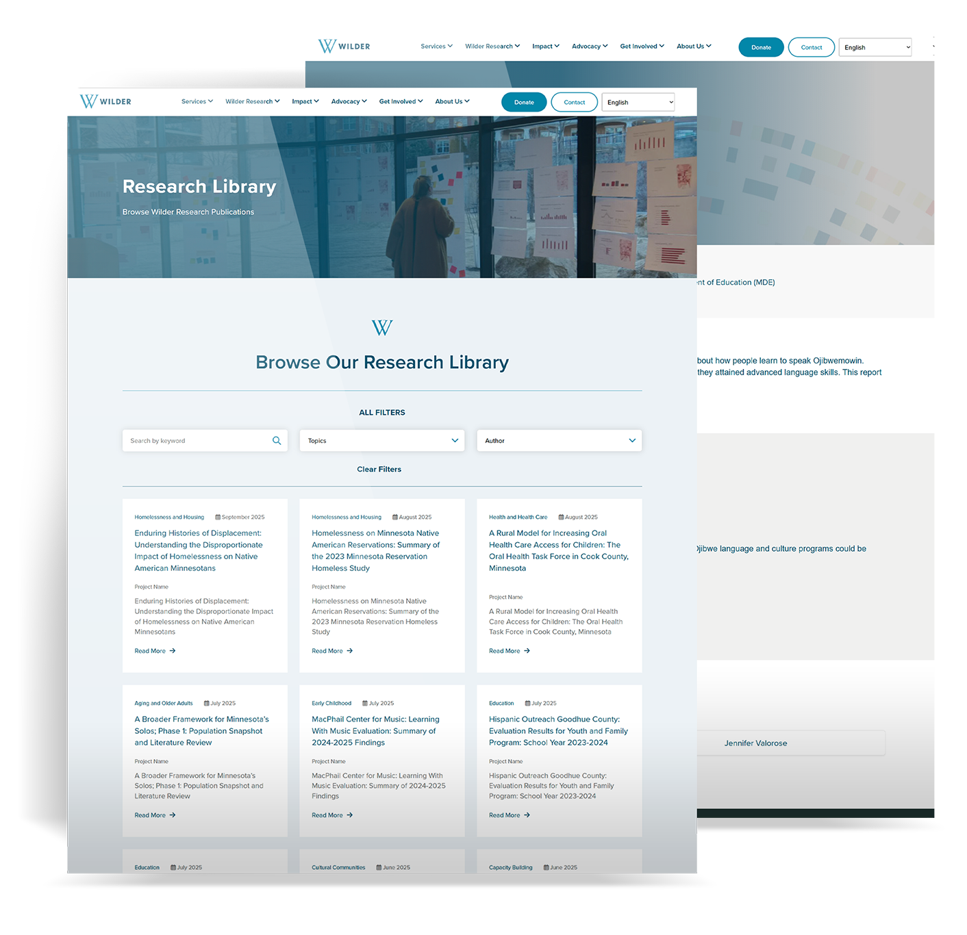
Useful search depended on clean imports, consistent metadata, and reliable record relationships.
Enlarge imageI had to connect the research behind the search box.
A useful result depended on the right metadata, related study, report details, and file. I built those relationships alongside the interface, with clean imports and a staged connection to Presto.
05 Results
I compared GA4 data from July 7 through August 5, 2025, with the previous 30 days. Service and support pages also recorded more views, and mobile use increased. These are post-launch comparisons, not proof of a single cause.
+26%
16,416 page viewsThe new homepage recorded 3,435 more views than the previous 30 days.
+365%
8,710 page viewsOne of Wilder’s most important service paths received far more traffic.
+238%
2,476 page viewsThe new library landing page received more than three times the traffic of the previous period.
+28.5%
4.8K active usersMobile active users rose after the responsive redesign. Tablet use rose 52.9%.
Views increased on volunteering, giving, contact, and Services. Those visits show people reaching the pages. Completed donations, inquiries, and requests for help need separate tracking.
Source: GA4 page-path, channel, engagement, and device comparisons for the first 30 days after launch versus the previous 30 days. Percentages are rounded for display.
I used the first month to review behavior and identify the next tracking questions.
Gains on mental health, childcare, supportive housing, aging, and Services showed visits reaching formerly buried content.
Research Library and Wilder Research pages recorded growth. That showed page activity, separate from whether someone found the right report.
Mobile and tablet use increased. I used that signal to keep examining the smaller-screen paths.
URLs, campaigns, search visibility, and behavior change together at launch. I treated these as signals, not proof of a single cause, and prioritized tracking completed actions.
Visitors could start with the help they needed, not Wilder’s internal structure.
Data, filters, result cards, report pages, and PDFs formed one searchable experience.
Templates, content types, fields, components, and import rules supported ongoing updates.
Post-launch analytics showed where to investigate and what to track next.
My contribution
I carried the public site and Research Library from user journeys and Figma layouts through WordPress development, Drupal migration, data integration, and post-launch review.
I connected a redesigned public website with the WordPress content system and research pipeline behind it. The work covered user journeys, interface design, Drupal migration, custom development, and launch.