Find where the page gets soft
The live page often loses force in small places: the headline, the offer, the proof, the CTA, or the mobile path. I look for the spots where people slow down, doubt, or leave.
These projects show the kind of work I get brought in for when a website or product looks fine, but the path to action is not clear enough.
Sometimes it starts with one important page. Sometimes it turns into a wider site update or product cleanup. The common thread is sharper message, better structure, stronger mobile paths, and execution that stays connected from idea to launch.
Whip Around needed key pages that explained the product faster, worked better on mobile, and made it easier for buyers to move toward a trial or demo. I redesigned the experience around clearer structure, tighter messaging, and lower-friction next steps.
The live page often loses force in small places: the headline, the offer, the proof, the CTA, or the mobile path. I look for the spots where people slow down, doubt, or leave.
Most pages do not need more sections first. They need fewer blockers. I clean up the structure, CTA flow, forms, mobile path, and moments where the page makes people work too hard.
I do more than hand back notes. I can help rewrite, redesign, and support the front-end build so the fix actually goes live.
Start with the pages closest to revenue.
Redesigning key pages so fleet buyers could understand the product faster, compare plans with less work, and move toward a trial or demo more easily.
Restructuring the experience so shippers and carriers could find the right path faster and take action with less hesitation, especially on mobile.
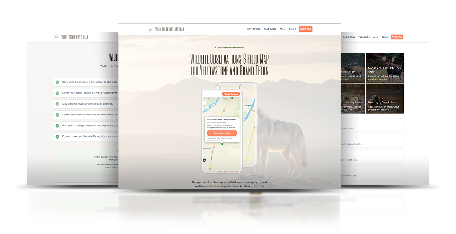
Designing a safer, more useful wildlife map with delayed sightings, offline-ready access, and clearer field use in Yellowstone and Grand Teton.
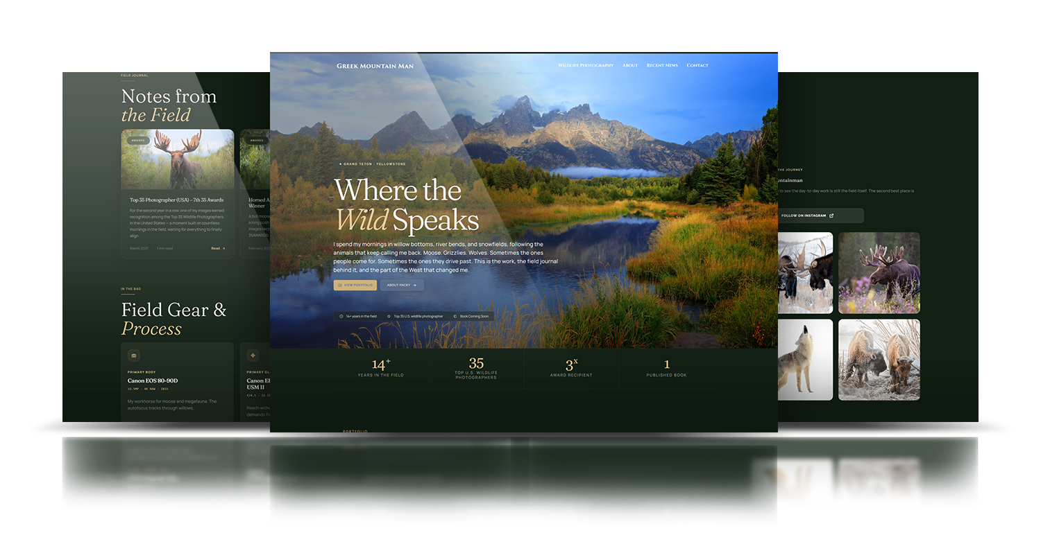
Creating a one-page storytelling site that could hold wildlife photography, field notes, and future offers without feeling scattered.
Coming soon
Noma needed a digital experience that could help employers and job seekers connect faster without making the process feel complicated. The goal was to create a clearer, more mobile-friendly platform.
The page answers the buying question fast instead of making people hunt for it.
Trust shows up before the CTA, not after it.
Key actions stay easy on smaller screens, where a lot of real use happens.
Less relay between message, UX, design, and build means less drift by launch.
I review one page or one flow by hand and flag the biggest blockers in the message, structure, proof, mobile path, and next step.
We decide what needs a rewrite, what needs a redesign, what should stay on that page, and what should carry into a wider site update.
Launch the update, review real behavior, and keep what works across the page, the flow, or the rest of the site.