Phase 01
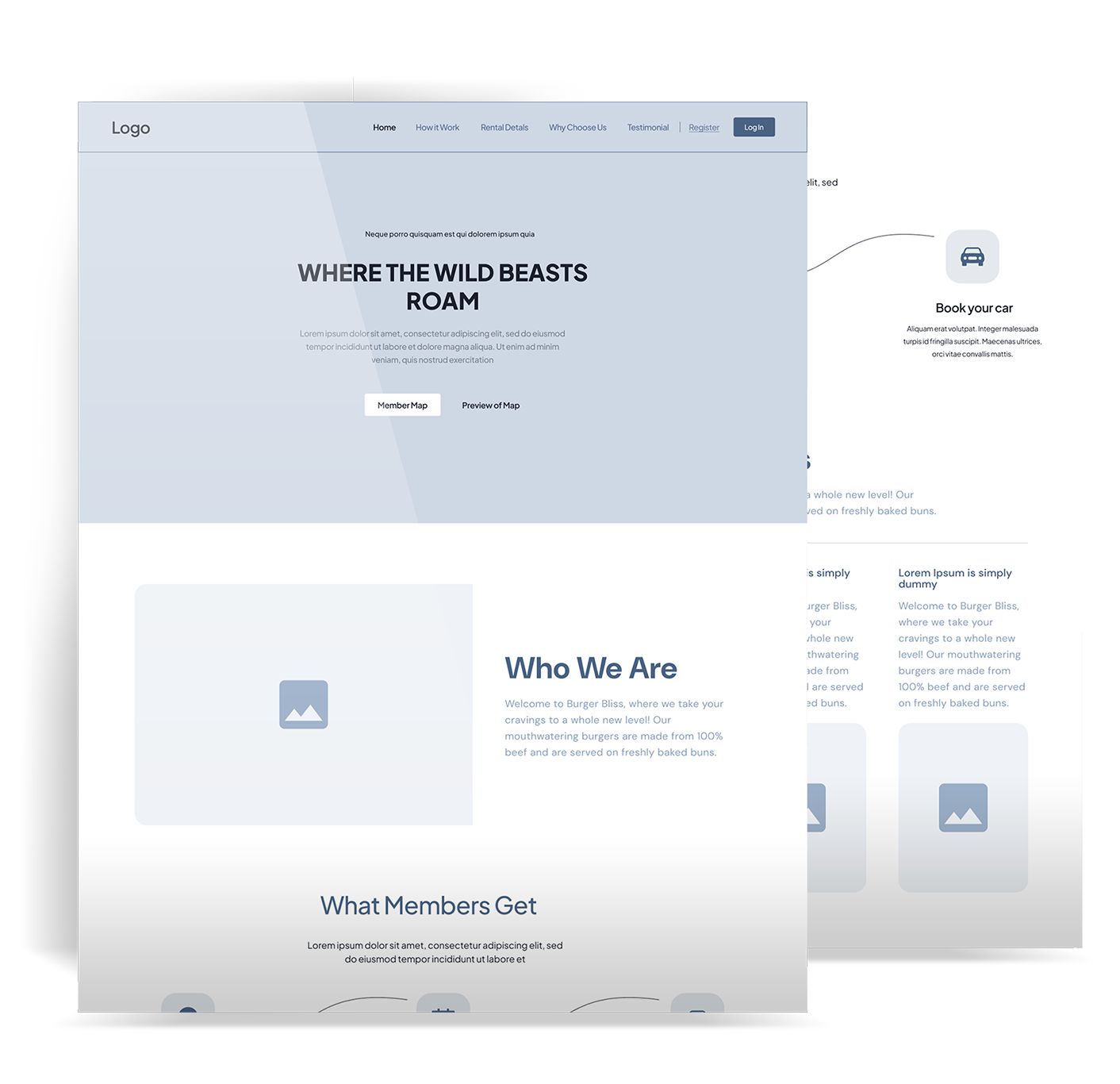
Wireframes
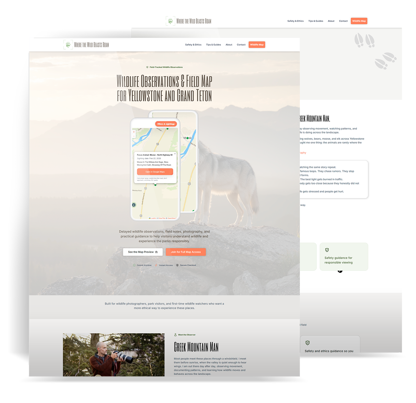
The first job was getting the highest-value actions clear. Open the map fast. See what is recent. Filter by species and area. Understand how to use the information responsibly.
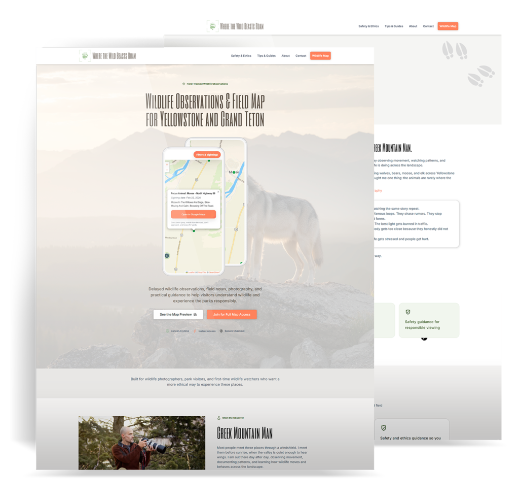


The first job was getting the highest-value actions clear. Open the map fast. See what is recent. Filter by species and area. Understand how to use the information responsibly.
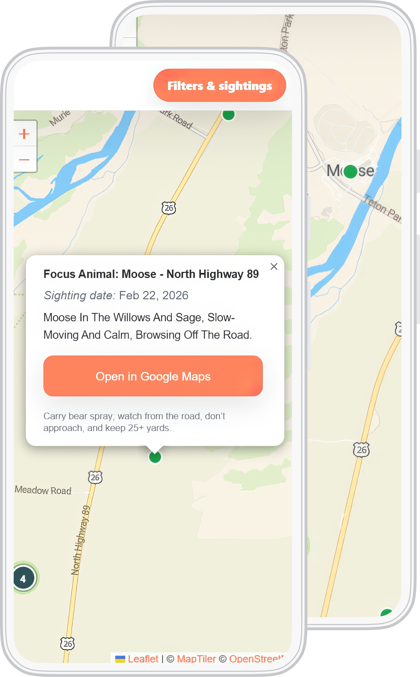
Once the structure was set, the product moved into build as a cleaner, faster experience designed for real use in and around the parks.
This product gets used on the move, often in low-signal areas. So the mobile experience had to work there first.