Interviews
I asked what buyers wanted to know and which questions the sales team kept hearing.
Whip Around helps businesses manage vehicle inspections and maintenance. Buyers needed to understand the software before starting a trial or booking a demo. I spoke with fleet buyers and users, planned the pages, and built the responsive website and landing pages.

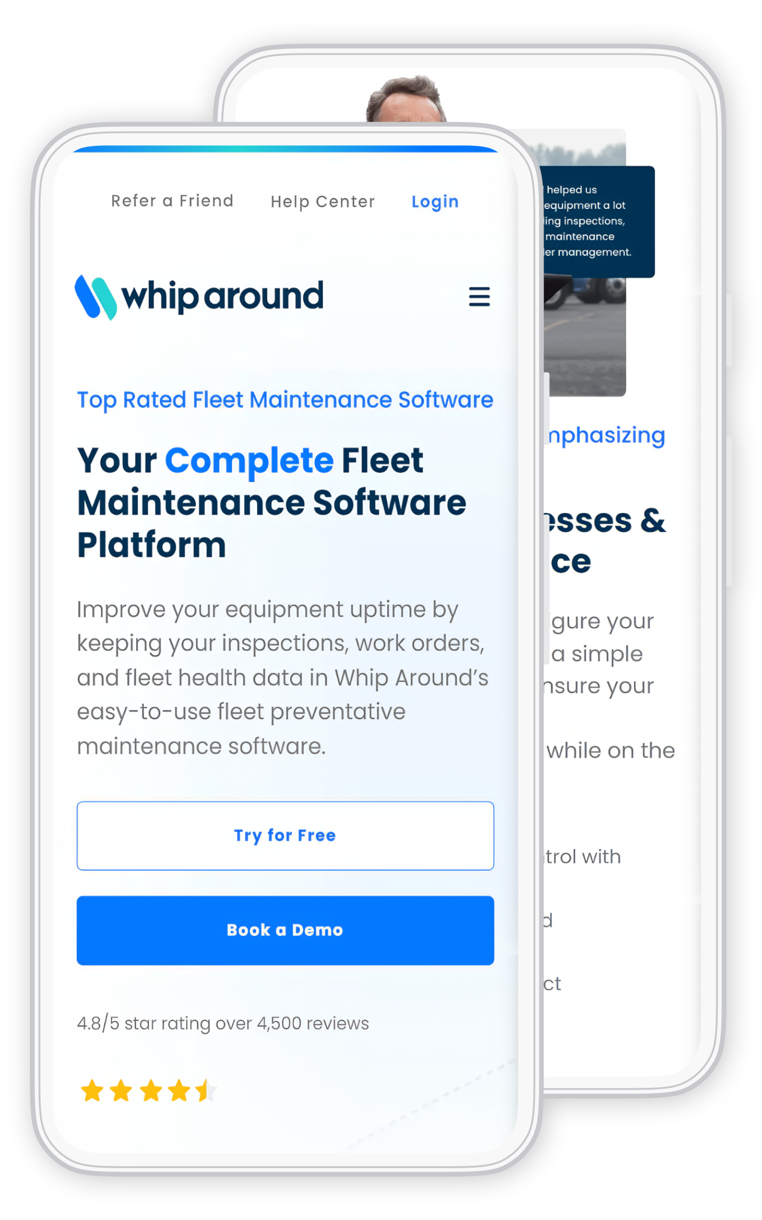
I spoke with buyers, software users, and the Whip Around team. I reviewed site traffic and heatmaps, drew page plans, and worked with the team on the words. I designed and coded the site, then checked what visitors did after launch.
01 Buyers
The old website listed features before explaining what Whip Around could do for a fleet. Buyers had to work out whether the software fit their team before starting a trial or booking a demo.
I spoke with buyers and people using the software. I used their questions, site traffic, and heatmaps to plan the pages. I designed the screens, built the front end, and checked what happened after launch.
I compared interviews with page visits, clicks, and how far people scrolled. I checked what the site said and where buyers stopped.
I asked what buyers wanted to know and which questions the sales team kept hearing.
I checked where people entered the site, what they read next, and where they left.
I reviewed where people clicked and how far they scrolled, including on phones.
I found repeated details, missing answers, and too many buttons asking for attention.
Who I spoke with
I spoke with fleet teams, people using the software, and the Whip Around team. I needed to learn what buyers cared about before they would try the product.
The people responsible for vehicles, equipment, and keeping maintenance work moving.
The people already using Whip Around in their work, not just reading about its features.
The people explaining the product and helping decide what the website needed to support.
The new pages explained what the software did, then showed how it could help. Customer proof appeared near the answers it supported. Buyers had a clear way to start a trial or book a demo.
Summary of the interviews, not a word-for-word transcript.
These examples show the questions each page needed to answer for different audience groups. They are not direct interview quotes.
What it does and how the team would start using it.
Needs to know: Will this make the operation easier without adding a system nobody uses?
How the team records inspections and follows up.
Needs to know: Will this help the team stay on top of inspections and accountability?
How the team spots issues, plans maintenance, and keeps vehicles available.
Needs to know: Does this fit the way our fleet works?
02 Design
Buyers could see what the software did, how it fit their work, and where to go next. I put answers and customer proof before the trial or demo choice.
Start with a vehicle or maintenance problem the buyer knows.
Explain how the software helps with that problem.
Show how the tools fit the buyer’s day-to-day work.
Show customer proof beside the question it answers.
Keep the free-trial and demo choices easy to find.
I brought the product explanation, customer proof, and trial or demo choices into one path. Then I built the pages for desktop and mobile.

These are pages I designed and built. Some images show the fleet software, which was outside my redesign.
The headline says what Whip Around does.
Ratings and customer logos sit near the introduction.
“Try for Free” and “Book a Demo” appear together.
Mobile path
I shortened the opening text and moved key answers higher on the page. I coded the mobile layouts and checked the links, buttons, and reading order on smaller screens.
03 Build
I wrote the HTML, CSS, and JavaScript for the website and landing pages. I built shared parts so the pages worked the same way. Then I tested the layouts and buttons through launch.
Structure first
I drew simple page plans to decide where the answers, customer proof, and buttons should go. I worked with the team to make the headings easier to understand.
We could review the page plan before I designed the final layouts and coded them.
Simplified page-structure illustration.
I built shared menus, cards, buttons, and styles. The team could use them across the site while giving each page its own message.
I grouped pages by the questions buyers brought to the site.
I put the key answer first, followed by proof and next steps.
I made the trial or demo button easy to find once buyers had the answer they needed.
I changed the layout and reading order to make the pages work on phones.
I made buttons, menus, and other controls work the same way across pages.
I reviewed clicks and page visits to see which paths people used after launch.
Design into code
I checked the pages on phones and computers. Because I designed and coded them, I could fix layout and button problems in the same pass.
04 Review
I reviewed visits, clicks, scroll depth and exits, then used those patterns to guide changes to the live pages.
I shortened it, moved it, changed the lead, or removed it.
I changed the interaction or its appearance so the two matched.
I changed the order and brought the demo path nearer the relevant content.
I made one action primary and gave the others a supporting role.
Entry pages, next pages, exits, and paths toward the demo.
Scroll depth and important content visitors passed over.
Click patterns, competing actions, and elements that looked clickable but were not.
Differences between desktop and mobile reading order and actions.
05 Results
I delivered the responsive website and landing pages, built reusable page components, and used analytics and heatmaps to guide changes after launch.
I explained how the software helped before listing its features.
Buyers could get answers and then choose a trial or a demo.
I built menus, cards, and page layouts that the team could use again.
I used real visits and clicks to improve the pages after launch.
I led the website work from buyer interviews and page plans through design, code, launch, and improvements after launch.
I talked with buyers, planned the pages, and built them. When visitor data showed something was hard to find, I could change both the page design and the code.