Phase 01
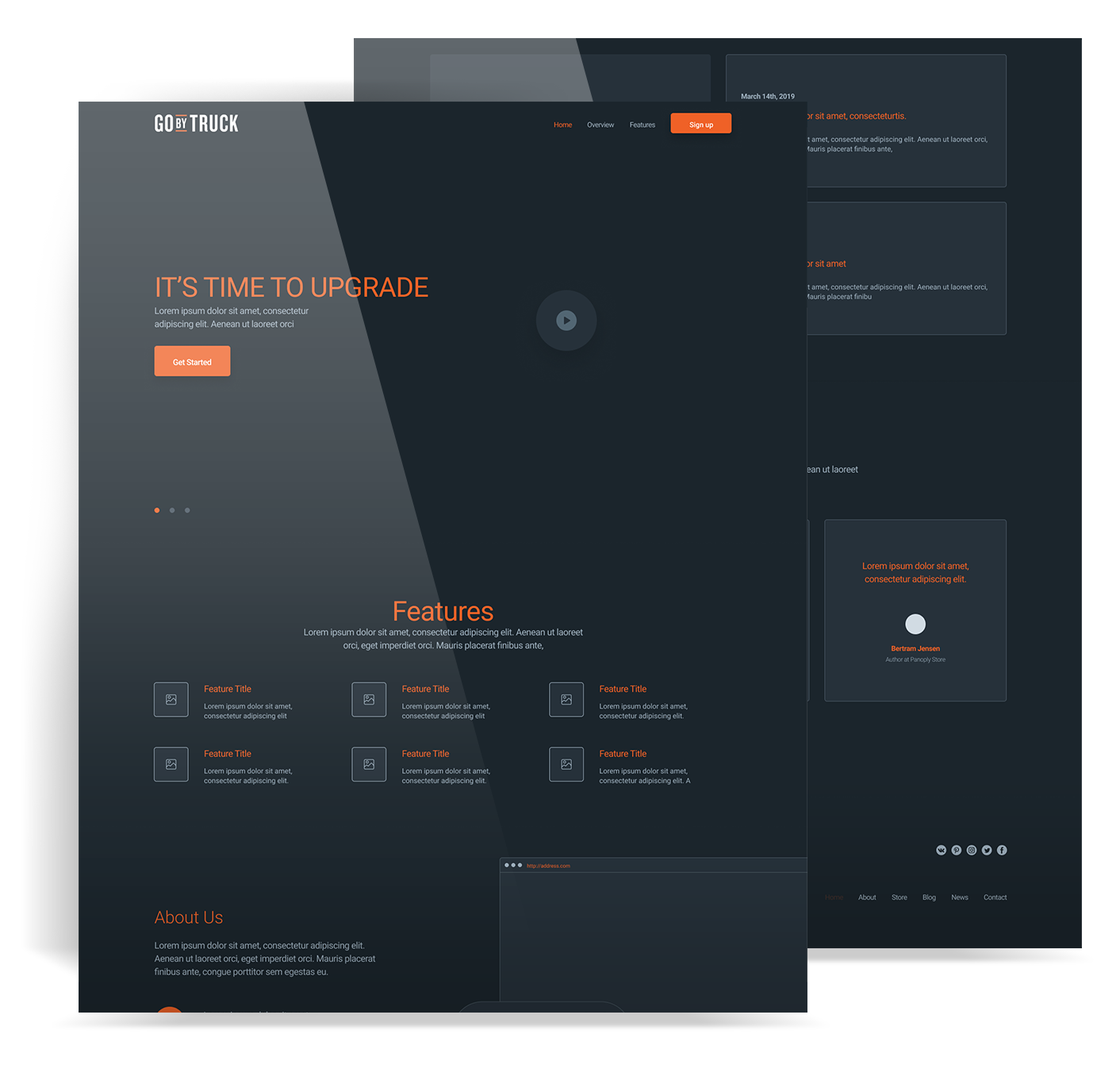
Wireframes
The first job was mapping the core journeys. The wireframes focused on helping shippers post freight quickly and helping carriers review and act on loads without confusion.
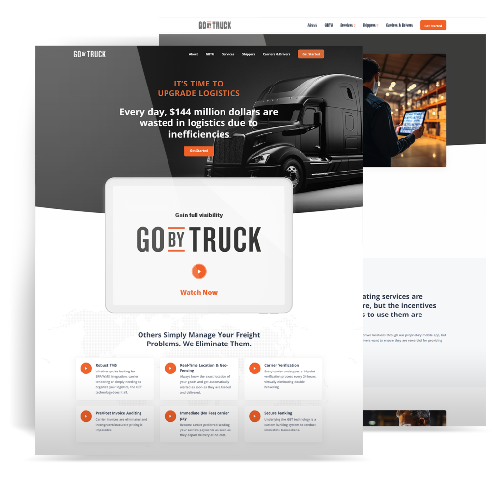


The first job was mapping the core journeys. The wireframes focused on helping shippers post freight quickly and helping carriers review and act on loads without confusion.
Once the structure was in place, the platform moved into development as a cleaner, more responsive experience built for real use across desktop and mobile.
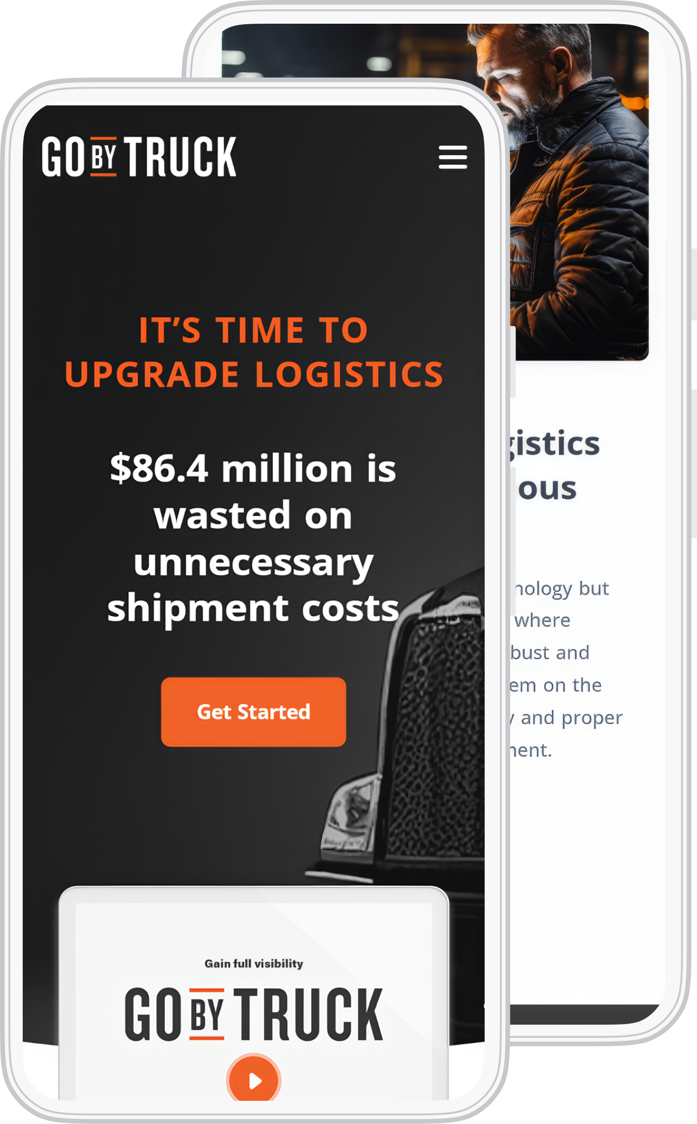
A large share of Go By Truck users are on mobile, so the mobile experience had to work before anything else did.