UX AGENT

Editorial Portfolio โ€ข Website Refresh

Sharpening Greek Mountain Man into a cleaner one-page storytelling site.

Greek Mountain Man needed a digital experience that could hold wildlife photography, field stories, and future offers in one place without feeling scattered. The work focused on one clear page flow, stronger visual rhythm, custom carousel layouts, and front-end details that made the whole site feel more intentional.

UX + Dev
End-to-end delivery
Mobile-First
Design approach
1 Page
Story Telling
Custom
Carousel UX
Code
HTML/CSS/Jquery

The Challenge

Greek Mountain Man already had strong material. The problem was shaping it into a better experience. The site needed to move cleanly from hero to photography, animal stories, about, field journal, gear, book, workshops, and contact without feeling like a stack of unrelated sections. It also needed a sharper visual system that could feel premium without getting in the way of the photography or the writing.

The Approach

The rebuild focused on structure first, then presentation. A one-page layout created a clearer story from top to bottom. Custom carousel treatments helped large image sections feel more editorial. Pill styling, glassmorphism details, and tighter front-end decisions made the page feel more finished without making it heavier.

Key Outcomes

What this project Delivered

Sharper
A cleaner visual system across the page
More immersive
Carousel-led storytelling and image flow
Clearer
Stronger section hierarchy and content rhythm
Stronger
A more polished one-page brand experience
Key Improvements

What Changed

1

Restructured the site into a cleaner one-page experience so visitors could move through the work, stories, journal, gear, book, workshops, and contact in one continuous flow.

2

Built and refined custom carousel sections so the photography and animal-story areas could breathe without falling into a static grid.

3

Introduced a sharper interface language through pill styling, glassmorphism, and tighter card and section treatments.

4

Used custom HTML and CSS to refine layout, spacing, hierarchy, and section transitions across desktop and mobile.

User Research

Who this was built for

The site needed to speak to different kinds of visitors without losing its voice. That meant building a structure that could support the photography, the wildlife stories, the field journal, and future offers in one clear experience.

Wildlife Audience

People who want to move through the photography and animal stories in a way that feels immersive, visual, and easy to follow.

Workshop and Book Audience

People who are also interested in the field journal, the gear and process, the upcoming book, workshops, and direct contact.

The Process

Wireframes to Launch

Phase 01 Wireframes preview

Wireframes

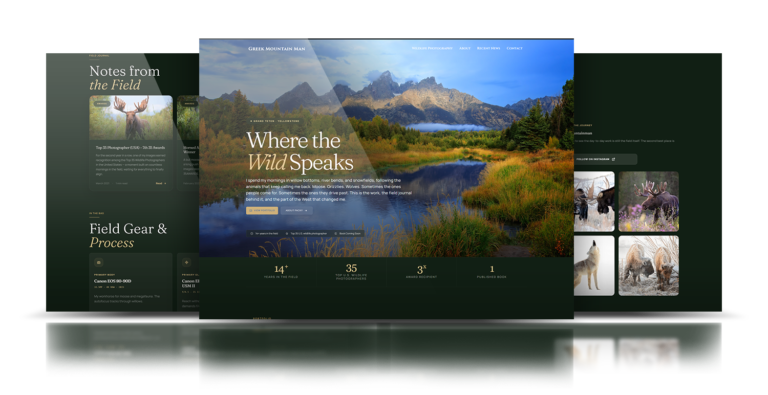
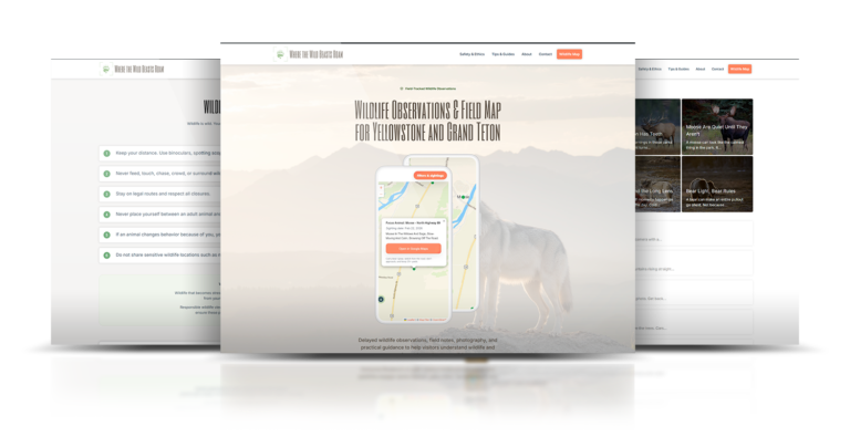
The first priority was the flow. The page needed a clearer sequence from hero to portfolio to story sections to about, then into journal, gear, book, workshops, and contact.

Phase 02 Development preview

Development

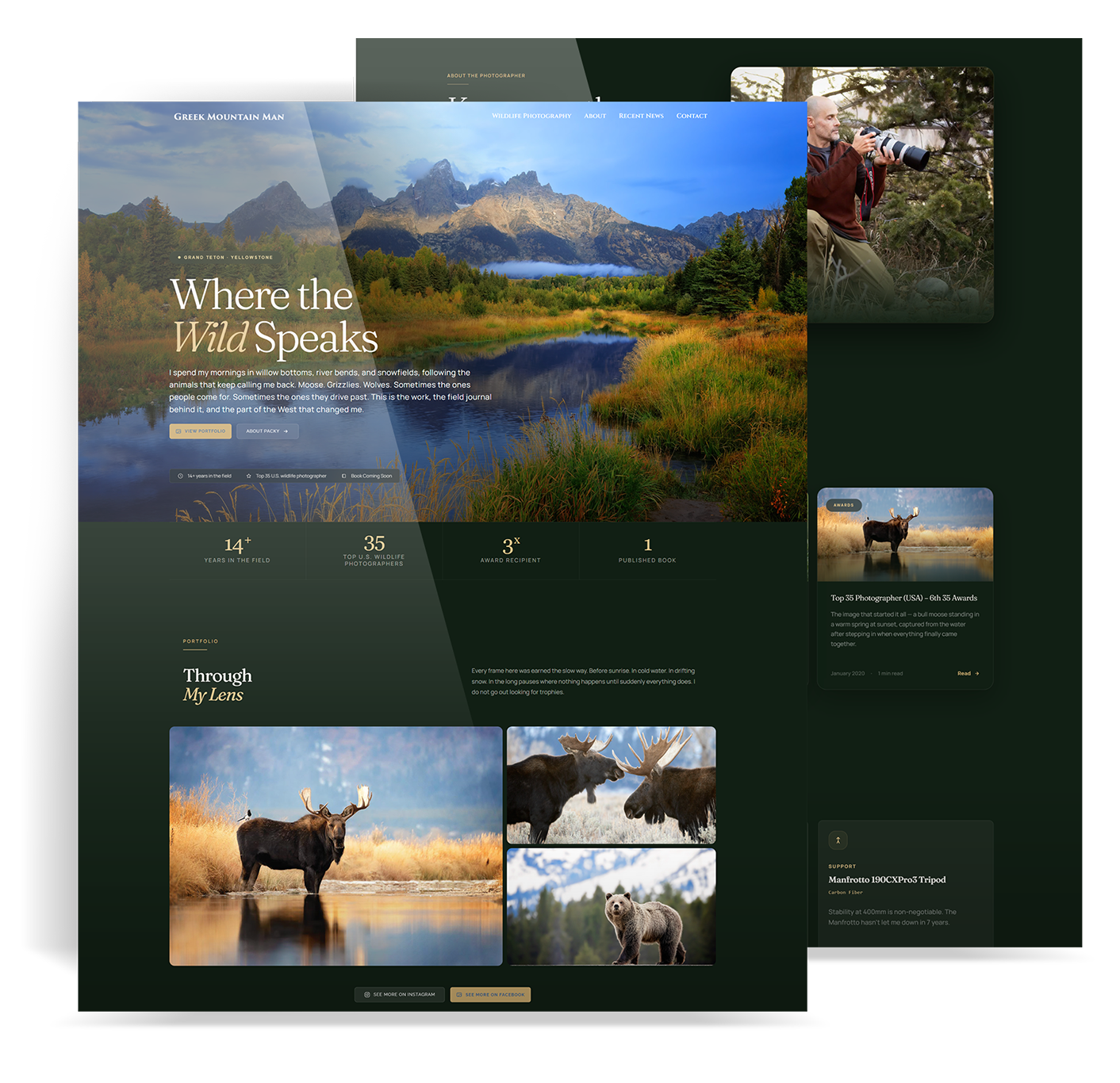
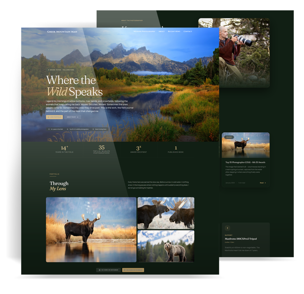
Once the structure was set, the work moved into the front end. Custom carousels, refined pills, glassmorphism, and tighter HTML/CSS polish turned the page from a simple content stack into a more editorial experience.

Mobile Experience

Built for the phone first

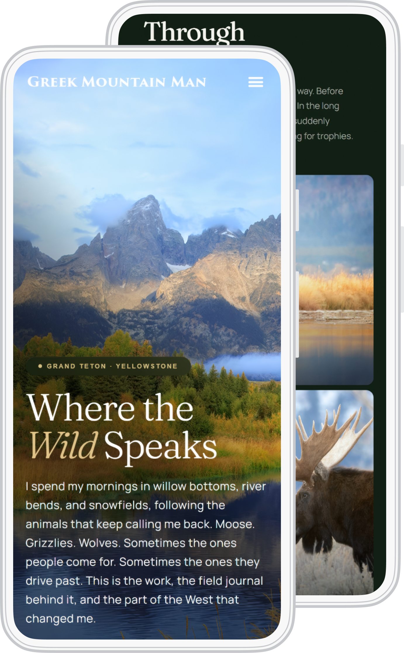
This site lives inside a long scroll, so the mobile experience had to hold together from the first section to the last.

  • Carousel sections that stay usable on smaller screens
  • Pill-based labels and actions with cleaner touch targets
  • Tighter spacing and content rhythm across long-scroll sectionsg
  • A more polished mobile presentation from hero to contact
Phone mockup preview
Design Thinking

Principles that drove every decision

Let the work lead

The photography and field stories needed to stay at the center, so the interface had to support the work instead of competing with it.

Create one clear path

A one-page structure made it easier for visitors to understand the site, move through it, and find the parts that mattered.

Add depth without clutter

The page needed more polish and dimension without losing lightness or readability.

Polish the details

A lot of the improvement came from the small things: cleaner pills, better spacing, stronger hierarchy, tighter HTML/CSS decisions, and more intentional transitions between sections.

Why agencies bring me in

One person across message, UX, and build.

Most teams split strategy, copy, design, and front-end work across different people. That is usually where sharp pages get softer. I work across the page so the message stays aligned from first review through launch.

Start With a Free Page Audit
๐Ÿ”Ž
UX Research
๐Ÿ“
Wireframing
๐ŸŽจ
UI Design
๐Ÿ’ป
Front-End Dev
โœ๏ธ
Copywriting
๐Ÿ“ˆ
Page Optimization
Ready to Work Together

Need this kind of page support on a client project?

Send the page, the brief, or the bottleneck that is closest to revenue. Iโ€™ll review it by hand and show you what I would fix first.

View More Case Studies: