Amy’s social media community
People were asked what they wanted to see on the website. Their feedback became part of the work.
Conversations and feedbackMaking a digital guide easy to find, try and buy means working through the whole visit. For Healing That Matters, that meant speaking with people, testing the website and bringing the guide previews, prices and downloads together. The work covers the writing, design, WordPress build and store setup. Amy created the guides.
Healing That Matters · Redesigned website
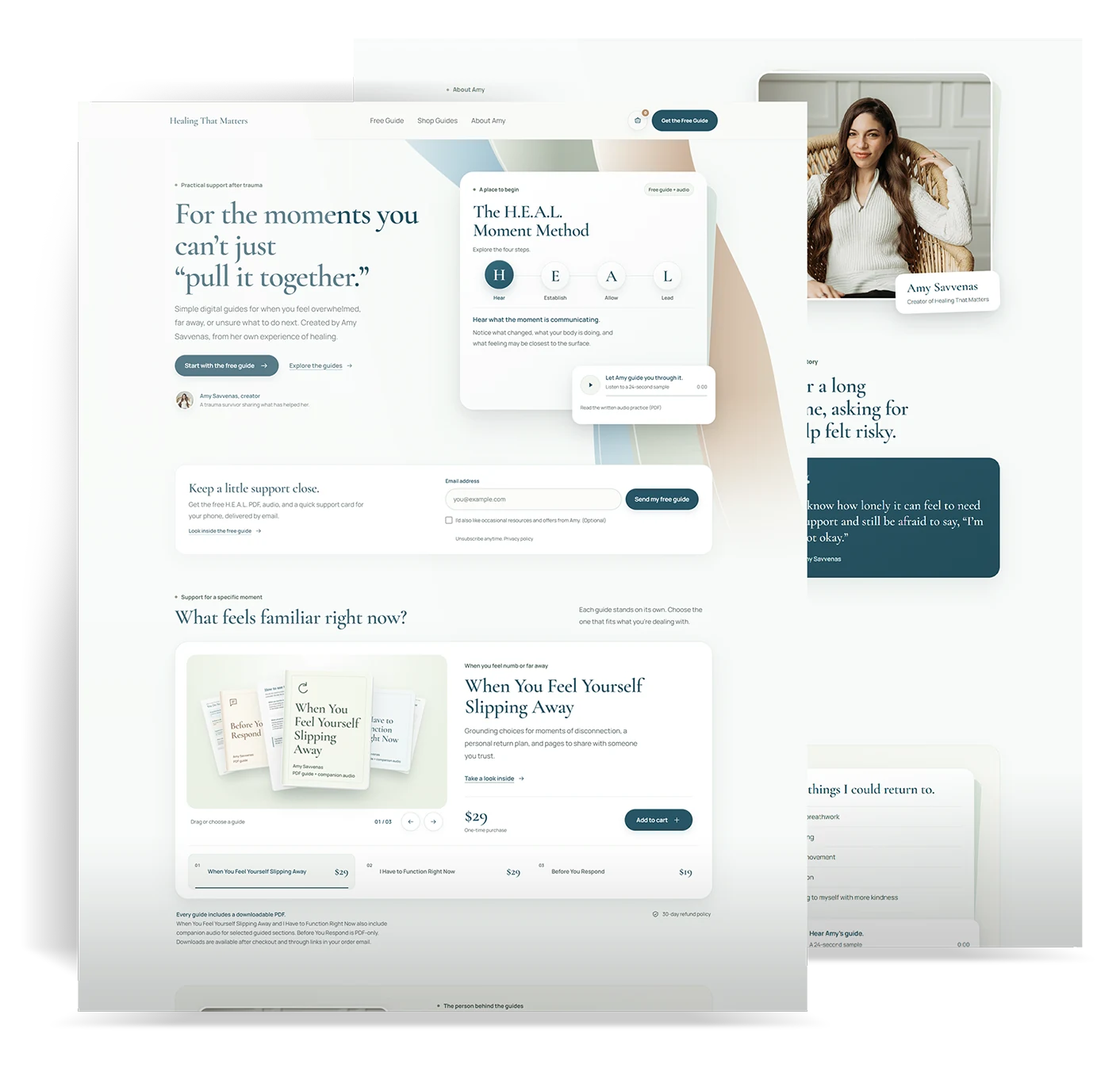
Follow the work from conversations and website testing to the redesign, purchase and downloads. Compare the original artwork, then see how the site is being reviewed.
Chapter 1 of 6
Follow the journey from a real need to a useful first step, then see who helped inform the work.
Making your website easier to use starts with understanding what people come for. For Healing That Matters, that means a clear path from finding support to trying a guide and getting the files.
A smaller place to start. A way to look inside. Clear choices about what comes next.
The free guide sits beside a plain explanation of who it’s for.
Preview a guide, see the formats and read the price together.
The purchase leads to labeled downloads and an order email.
Understanding the first visit
Bringing the conversations and website feedback into the design.
People were asked what they wanted to see on the website. Their feedback became part of the work.
Conversations and feedbackFive people were paid to try the website and share feedback on the experience.
Website testingChapter 2 of 6
Compare the homepage openings, then work through the reconstructed page structure.
The earlier site introduced a broad healing offer, with appointments and “Coming Soon” buttons. The redesign puts a free guide up front and keeps paid guide previews, prices and what’s included together.
Compare the homepage message, the guide offer and the first action.
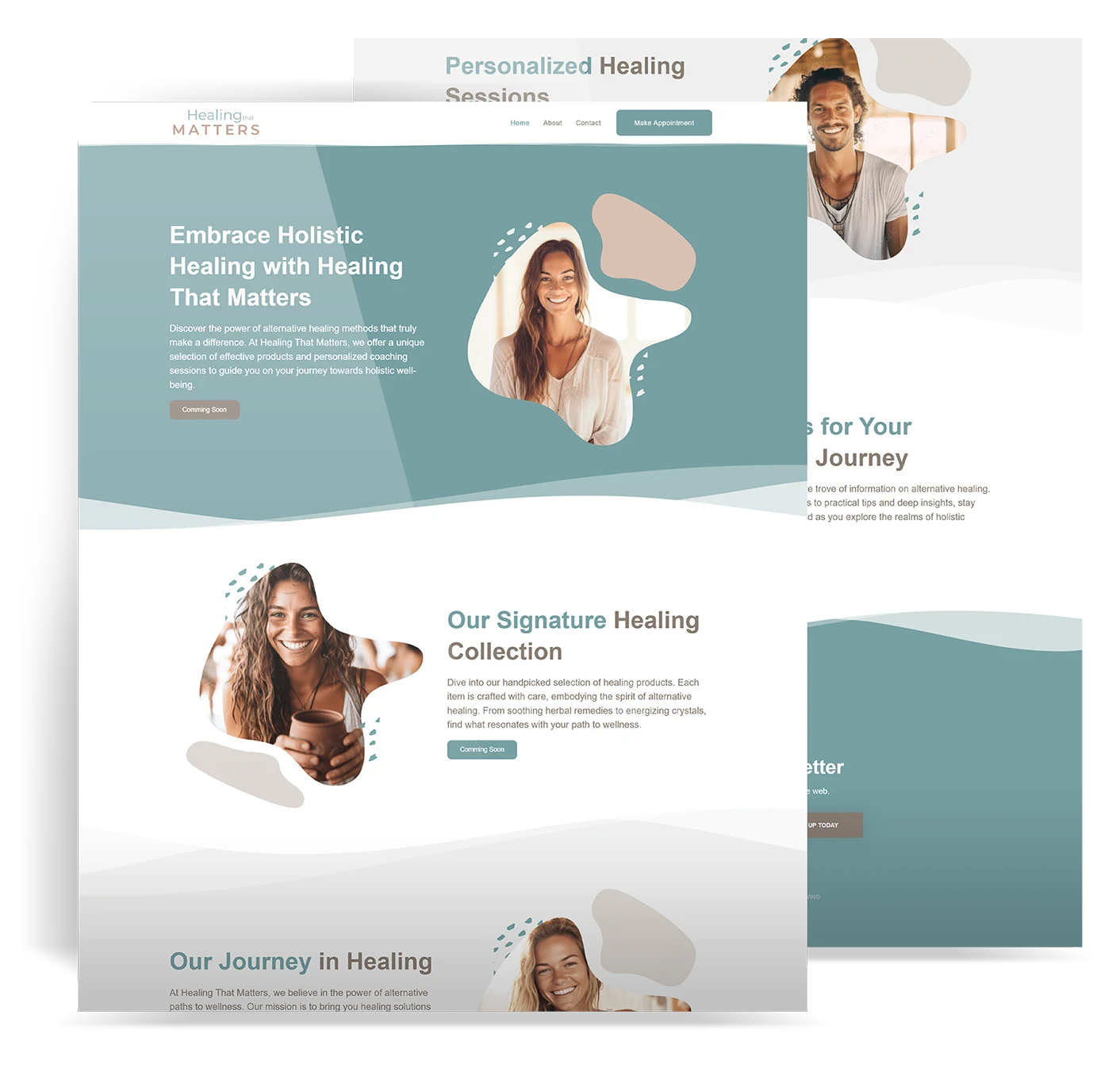
A broad healing offer, appointments and “Coming Soon” actions.
A free guide to start with, real previews and paid guide choices.
Explore the flow
Follow a visit from choosing a guide to getting the files. Each screen has a job: help someone start, explain what’s included and make the files easy to find.
Step 1 of 3
The free guide gives someone a place to begin. The paid guides sit together so they can see the choices without searching through separate pages.
Step 2 of 3
Keep the preview close to the guide details. Someone can read a sample, check the format and see the price before adding the guide to their cart.
Step 3 of 3
The order needs to lead to something someone can use. Keep the guide and audio links easy to find on the confirmation page and in the order email.
Reconstructed for this case study from the implemented website and store. These are explanatory wireframes, not original research screens or a working checkout.
Chapter 3 of 6
See how the free guide and audio introduce the offer before the paid guide choices.
Letting people try something useful gives the offer a clear starting point. Healing That Matters offers the H.E.A.L. Moment Method as a free guide, with an audio version for people who prefer to listen.
One free resource, with a way to read and a way to listen.
A PDF introduces the four steps and gives people something they can return to.
The audio gives people another way to work through the same free resource.
The homepage, free-guide area and Amy’s story carry the same message across the website. This is the original three-screen project artwork.
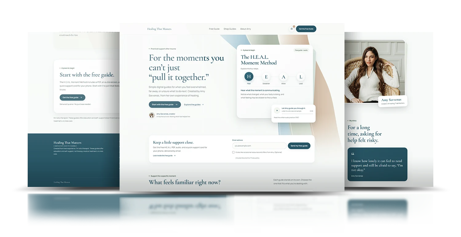 Open full artwork ↗
Chapter 4 of 6
Try the shared page parts, then see how they work on a phone.
Taking the design into a working website means checking what happens after the main button too. The responsive pages were built in Elementor, with WooCommerce handling the digital guides, orders and downloads.
From the page design to a working store
Choosing a guide is only part of the job. The steps, previews, prices and files need to make sense together. The build connects those details through HTML, CSS and JavaScript, with WordPress and WooCommerce handling the products and downloads.
01 / A place to begin
The H.E.A.L. method has four parts. Keeping them in one panel gives visitors a way to explore without moving through four separate pages.
The selected letter and label change together, with space for each step’s explanation. The choice stays clear when someone uses a mouse, a touchscreen or a keyboard.
A place to begin
The selected step has its own explanation. The other three stay within reach.
02 / Choosing what fits
Each guide has a preview, a price and a clear file format. Visitors can see what they are choosing before adding it to the cart.
The same card pattern works for a guide with companion audio or one that is PDF only. The product details change with the guide.
A guide for a specific moment
PDF + companion audio
Example 1 of 3 · PDF + companion audio
03 / After the purchase
The work continues after the pay button. Product names, file labels and order messages need to help customers find what they bought.
WooCommerce connects each product to its files. The order page and email give customers a way back to the downloads.
Example order
File names and access instructions stay together on the order page and in the email.
Reconstructed interactive case-study examples, based on the website’s implemented patterns. These are not archived Figma screens. The order illustration does not place an order or download a file.
Clear steps, guide previews, formats and prices.
HTML, CSS and JavaScript for the working interface.
WordPress and WooCommerce products, checkout and files.
Test orders, payment states, emails and downloads.
Mobile experience
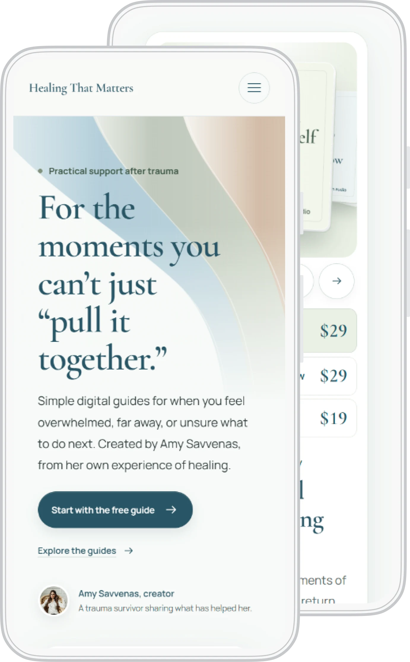
The phone layout brings the free guide, paid guide choices and purchase actions into a smaller screen. The artwork shows the same website, with the page order and spacing worked through for mobile.
The confirmation page puts the file links before order metadata. PDF and audio labels identify what each link delivers.
Order emails follow the site’s white cards, subtle shadows and brand colors. Paid-order emails include a PDF receipt.
Removing a guide exposed an out-of-date cart display. The removal action was changed to load the cart confirmed by the server.
The build combines HTML, CSS, JavaScript, WordPress settings and PHP hooks for the email and receipt styles. AI supported code iteration and troubleshooting, with Packy directing the design and reviewing the working result. WooCommerce and Stripe handle commerce and payments.
Chapter 5 of 6
Look at the purchase, receipt and download checks.
Following the whole purchase helps catch the details people depend on. The checks covered payments, order emails and the files customers receive. These were functional checks, separate from the five paid website testers.
All three PDFs opened. All nine paid audio files downloaded through a test order.
Successful and declined sandbox card payments were tested without moving real money.
An existing expired-checkout event was replayed. Stripe received HTTP 200 and WooCommerce confirmed processing.
A test order email arrived with its PDF receipt attachment. File links and labels were checked.
A real-money checkout was not performed. There are no verified conversion or health-outcome measurements to report. The screenshots show the live website as a logged-out visitor.
Chapter 6 of 6
View the actual scroll capture separately from an illustrative click map.
Review and improve
The actual scroll capture is from an earlier website iteration. The click-map example uses the current redesign to show the actions being reviewed.
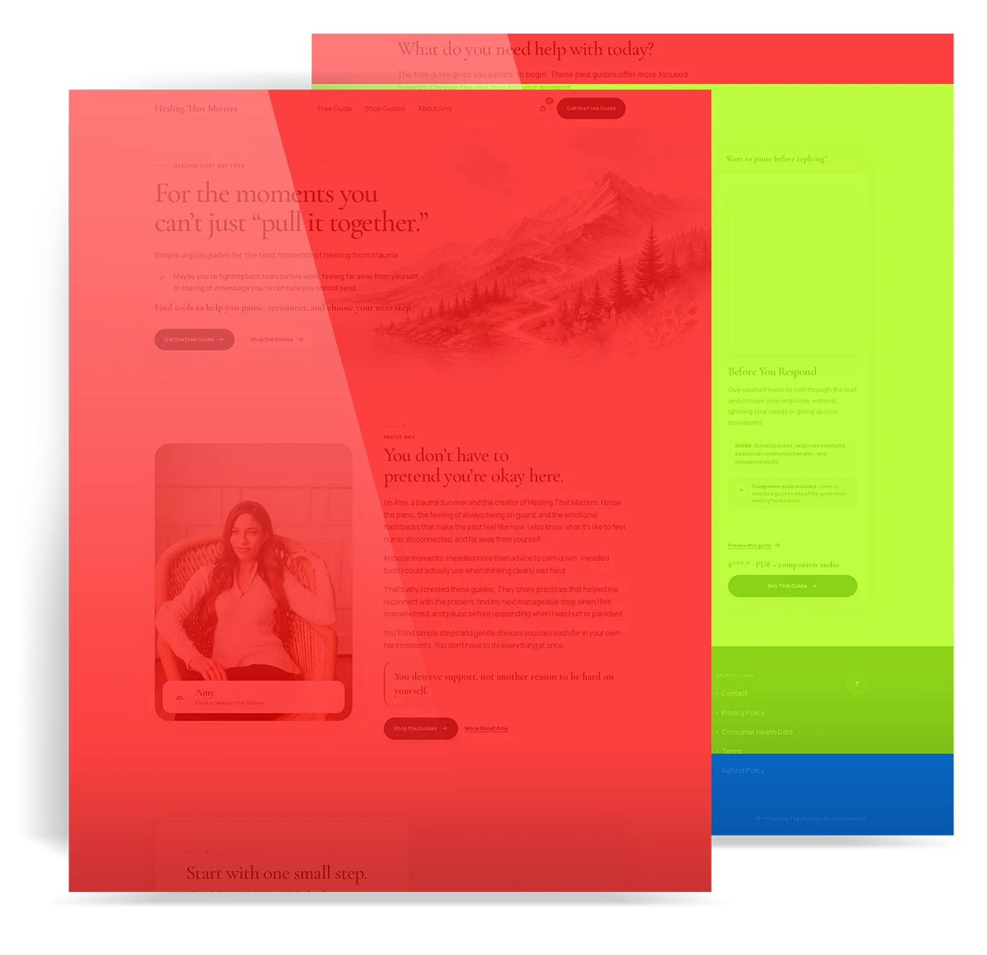
The website brings together real guide previews, a free-guide signup, three paid digital products and branded order communications. The page design and store setup follow the same path.
Visitors can try the free resource or explore a guide for a specific moment.
Guide descriptions, prices, and formats match the products and attached files.
The order page and email give customers a way to find and download their purchase.
Keeping the work connected
Designing and implementing the experience brought the mobile layout, guide descriptions, cart behavior and receipt readability into the same build. Each decision had to work beyond the mockup.
Explore the selected work Talk about your project More case studies