Risk → answers → action
Know the Dangers

Visitor questionWhat do I need to know or do right now?
Next stepUnderstand the risk, find naloxone, or get help
People came to Know the Dangers for answers, naloxone, or help. The campaign’s growing content made those paths hard to find. I redesigned the navigation, content, and mobile experience, then built the WordPress front end around what visitors needed to do next.
I spoke with campaign staff and people with lived experience, then reviewed analytics, heatmaps, and content. I mapped visitor paths, created wireframes, wrote the pages, designed the interface, and built the responsive WordPress front end in HTML, CSS, and JavaScript. I also handled accessibility, SEO, tracking, launch support, and post-launch review.
01 People
Know the Dangers began with synthetic-drug education. As opioid facts, warnings, stories, and resources grew, the site’s structure no longer made the next step clear.
Someone worried about immediate danger needed a different starting point from a family member, a person seeking treatment, or an educator. I redesigned the navigation and pages around those different needs.
I owned the website redesign and responsive WordPress build. Conversations with campaign staff and people with lived experience, alongside analytics and heatmaps, shaped what I changed. I carried those decisions from wireframes and writing through the live pages and post-launch review.
The question behind the redesign
Can someone under pressure find the right action before reading the whole page?
Conversations gave me the priorities. Analytics, heatmaps, and the content review showed how the site presented them. I used both to decide what needed to move forward.
I followed entry pages, traffic sources, and device use, then reviewed the routes to help, naloxone, treatment, resources, and recovery content.
I checked clicks and scroll depth to see which choices drew attention and which resources sat further down the page.
Campaign stakeholders helped define public-health goals, accurate language, priority resources, and audience needs.
I identified outdated priorities, repeated ideas, buried resources, unclear labels, and weak search entry points.
I used these audience needs to shape the starting choices. Someone looking for facts should not have to follow the same route as someone looking for help.
May be scared, moving fast, and unsure whether what they are seeing is an overdose.
Needs to know: Is this an emergency, and what do I do now?
Needs clear guidance, signs to watch for, naloxone access, and support without judgment or jargon.
Needs to know: How can I help without making this worse?
May need reassurance, a clear route to care, recovery stories, and a first step that feels possible.
Needs to know: Where can I start, and will someone meet me there?
Needs trustworthy facts, useful materials, and a simple way to point other people toward help.
Needs to know: What can I trust, use, and share?
Who I spoke with
I spoke with campaign staff and people who were using drugs. Those conversations made a priority clear: people needed a quick route to resources and naloxone.
The team helped define the information, language, and priority resources the website needed to support.
People described what they needed to reach quickly. I used those conversations to prioritize resources and naloxone in the first choices on the site.
I brought those needs together with the analytics, heatmaps, and content review. I made the naloxone action prominent and kept it visible as people scrolled, with direct routes to resources alongside it.
Retrospective summary, not verbatim interview notes.
02 Design
I separated the route to urgent help from the routes to learning and support. That let the site serve different needs without asking everyone to work through the campaign introduction. The navigation and mobile reading order followed those choices.
Emergency instructions before campaign messaging.
Direct paths to facts, warning signs, fentanyl, overdose, and changing risks.
What naloxone is, how it works, and where to find it.
Treatment, recovery, local resources, and help for someone else.
Facts, stories, videos, and community resources.
Representative reconstruction
I laid out urgent guidance, help and learning paths, audience choices, and supporting content before refining the visual design. This is a representative reconstruction of that planning logic, not an original working file.
The opening offered a place to begin. Supporting content explained the options further down the page.
The page order guided the interface details: labels, typography, cards, buttons, and where important actions returned.
Emergency guidance, naloxone, and help came before campaign introductions.
Familiar labels established the path. Clinical detail stayed available further in.
With 83.8% of visitors on mobile, I designed reading order, controls, forms, maps, and actions for phones first.
Important actions returned where the surrounding information gave people a reason to use them.
The campaign stayed recognizable. I changed the navigation, layouts, and content order so help and audience choices came first, with education and supporting detail below.
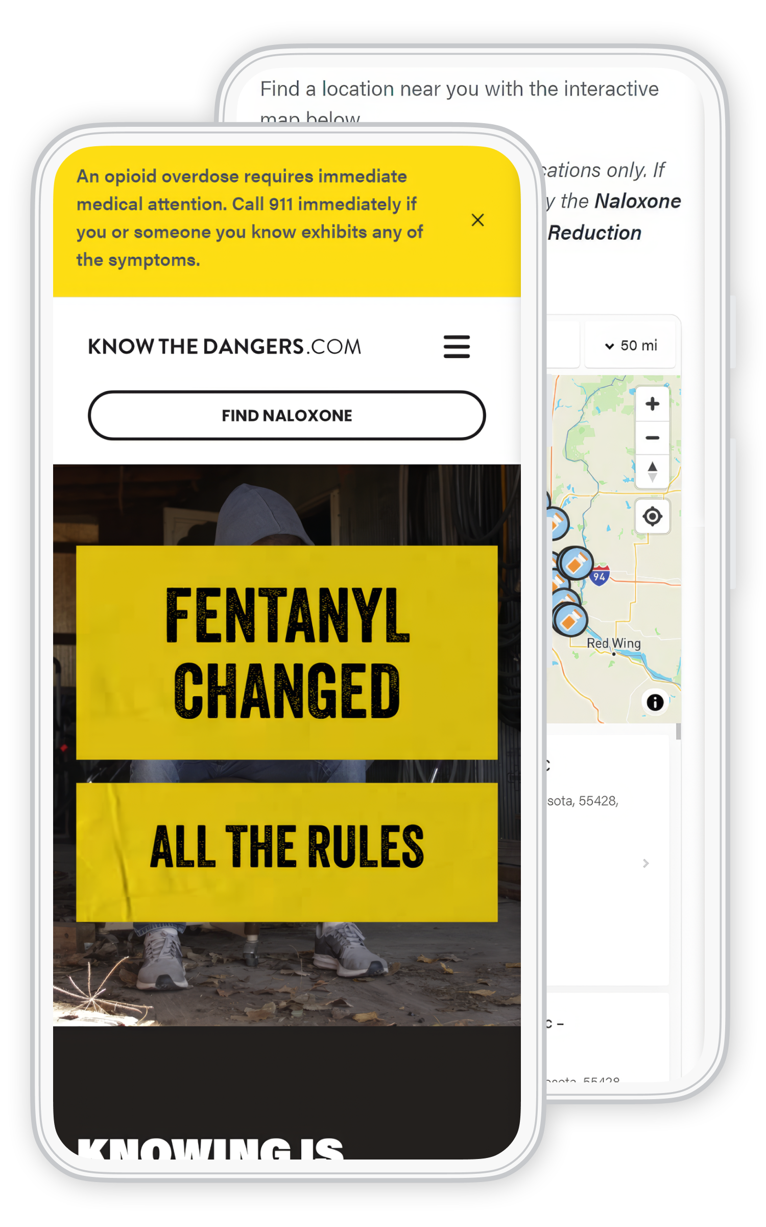
The screenshots show how I changed both the visual hierarchy and the routes through the content.
Mobile path
I simplified the header, shortened the openings, and gave controls more room to tap. Urgent routes stayed near the top. Further down, I placed actions beside the information that explained them.
 Enlarge image
03 Build
I wrote the HTML, CSS, and JavaScript and built reusable WordPress components for the pages, finder, resources, and forms. I carried the reading order and urgent actions into the responsive build, with accessibility, SEO, tracking, and release checks included.
I built shared page and content components so editors could update resources and campaign material without rebuilding layouts or losing the reading order.
I built the HTML and responsive CSS around task-based navigation, clear headings, and direct paths to facts, naloxone, treatment, and resources.
I built the persistent emergency layer and shared page layouts so urgent actions stayed visible without overwhelming the content. CSS controlled type, spacing, cards, and smaller-screen order.
I built WordPress components for audience cards, warnings, resources, stories, lessons, videos, and actions. Shared layout rules kept new content inside the design.
I set up the pages so editors could update information while preserving spacing, hierarchy, accessibility, and mobile behavior.
I implemented JavaScript components and checked navigation, forms, maps, and actions in the browser. Keyboard support, tap behavior, and responsive states stayed part of the review.
I checked headings, contrast, alt text, metadata, crawlable content, mobile performance, tracking, and heatmaps before and after launch.
I reviewed traffic, heatmaps, device use, and stakeholder input to identify buried actions.
I grouped content around urgent questions, risks, naloxone, treatment, recovery, stories, audiences, and resources.
I created wireframes for the emergency layer, message, help paths, audience choices, and repeated actions.
I designed readable type, clear buttons, reusable cards, and human imagery to balance urgency with hope.
I built responsive HTML, CSS, JavaScript, and WordPress components for resources, the finder, forms, and content.
I reviewed traffic, mobile use, engagement, scroll depth, actions, forms, and search growth after launch.

Design into code
I followed the routes through the working pages, finder, and forms. I checked reading order, urgent messages, tap behavior, and resource links together, so the review covered what happened between pages as well as inside them.
04 Behavior
Heatmaps showed attention around emergency guidance, navigation, search, “Get Help Now,” and the first content choices. Fewer people reached the lower sections. I moved priority resources earlier and repeated actions where the content gave people a reason to use them.
Emergency guidance, search, navigation, and the help action earned attention before deeper campaign content.
I made the early content choices part of the route through the page rather than relying on a long introduction.
Scroll depth dropped further down the page, so I moved important resources earlier instead of depending on everyone reaching them.
I placed important actions after the information that explained them, giving readers another route to help as they continued.
The original heatmap and scroll-depth image show the clicks and reading depth I reviewed when refining the page.

This review informed changes to the first screen, resource placement, and where help actions returned.
Enlarge imageI could not depend on someone reaching the bottom of the page to find help.
I kept urgent routes near the top and placed later actions beside the information that explained them.
I used the same checks as new pages, stories, campaigns, and resources were added.
Keep emergency guidance and help visible, readable, and separate from campaign messaging.
Track routes to naloxone, treatment, forms, maps, and resources, not just page views.
Review the order and length of every new section on a phone.
Use growing search entry pages to identify questions that need a clearer next step.
05 Results
The reported period combined the redesign, mobile improvements, SEO, content, social and cross-network campaigns. These figures describe that combined work, not the effect of one screen.
+2,681.65%
Reported user growthThe campaign and redesigned experience reached a much larger audience during the measured period.
7,621
New usersSocial and cross-network campaigns brought thousands of new people to the public-health resource.
83.8%
Visitors on mobileThe audience confirmed that mobile order, speed, tap behavior, and short reading windows had to lead the design.
+240.79%
Resource page viewsA high-priority resource page saw a large increase in use after the redesign and campaign work.
I brought priority resources forward and placed actions such as “Get Help Now” beside the information that explained them. The analytics summary reports more exploration of priority content and more activity on recovery-related forms during the combined redesign and campaign work.
Performance figures come from the analytics summary supplied for this case study. They reflect the measured redesign and campaign period. They show the overall direction, not the impact of one isolated design change.
I read the results alongside the heatmaps: who arrived, which devices they used, and whether they reached priority content. Together, they guided the next review. The figures reflect the combined work, not an isolated design test.
The device mix supported designing for phones from the start.
Resource views reflected the combined work on navigation, search, campaign traffic, and page order.
More traffic needed a clear route to help, naloxone, treatment, and resources after the click.
Analytics and heatmaps helped the team review new content and changing needs after launch.
Direct routes to emergency guidance, help, naloxone, treatment, and resources.
Reading order and tap behavior built around the device most people used.
SEO, campaigns, content, and UX connected visitors to priority information.
Analytics, heatmaps, forms, and action tracking informed future changes.
My contribution
I researched the problem, mapped the visitor journeys, wrote the content, designed the interface, and built the responsive WordPress front end. Accessibility, SEO, release checks, and post-launch review stayed part of that work.
I kept the same question in view from the first conversations to the working site: what does this person need next? I carried the answer through the content, layouts, and code, then used analytics and heatmaps to guide the next update.

