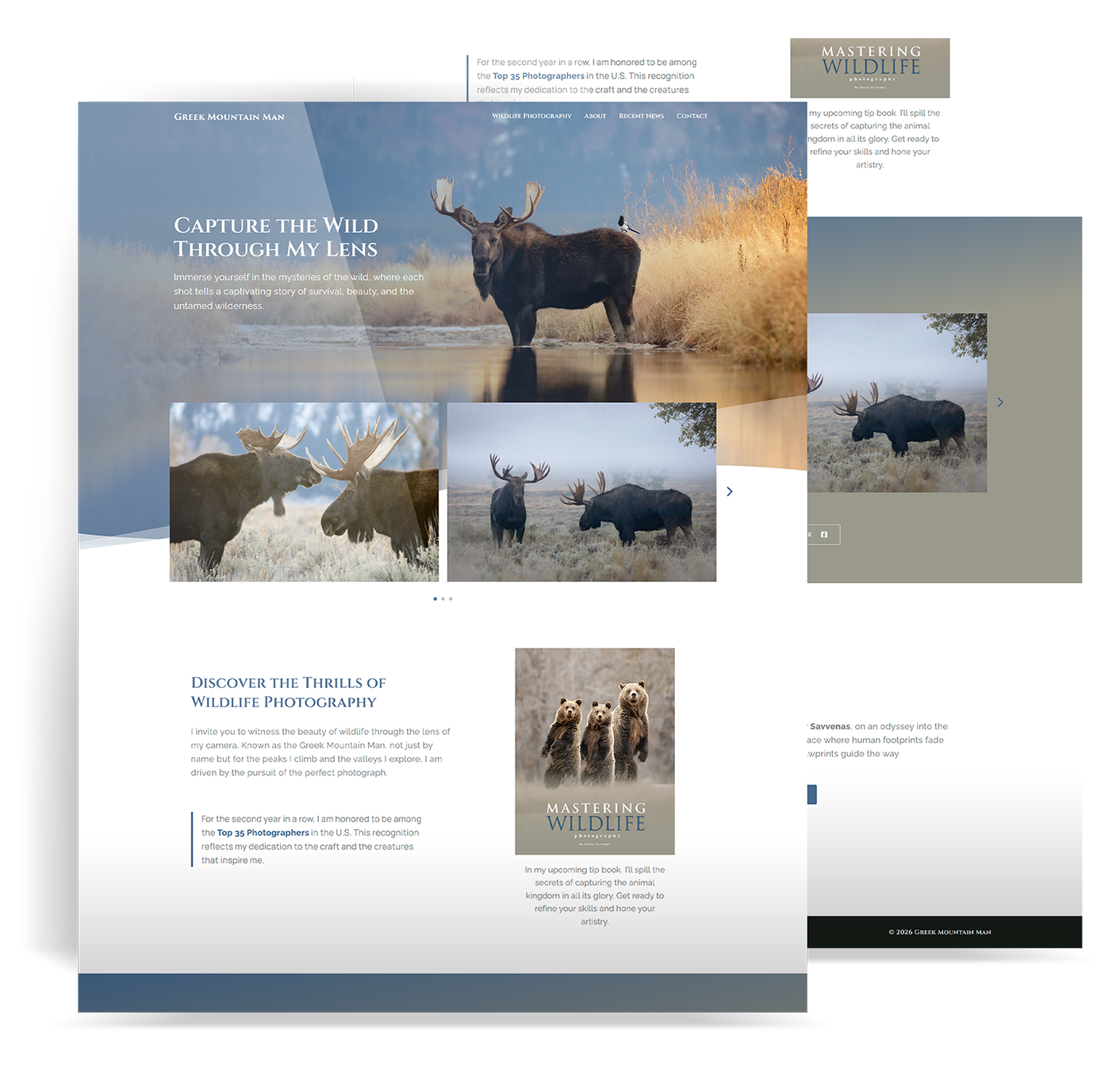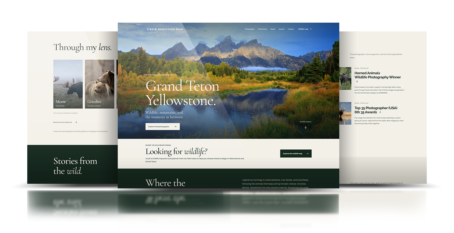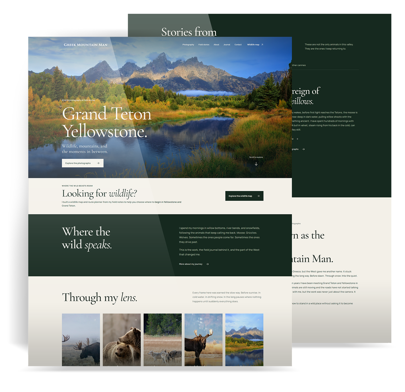
The goal: Give the photography and field stories room to breathe, make Greek Mountain Man easy to understand, and point people toward the work, the book, and what comes next.
I reviewed the pages, photography, field stories, and ideas I had built up over the years, then decided what still earned a place. I rebuilt the site around one clear story, rewrote the copy, designed the interface, created the custom photo carousel, and built the responsive WordPress experience. The hard part was not removing content. It was keeping the depth without making people dig for it.
01 Focus
Greek Mountain Man started as a place to share my wildlife photography. Then it grew: animal stories, field notes, awards, gear, social posts, a book, workshops, a wildlife map, and every new idea I wanted to chase. Each piece belonged. Together, they made a new visitor work too hard to find the heart of it.
The site had gotten huge because the project had gotten huge. Every new idea became another page, menu item, introduction, or explanation. The photography was still there, but it was no longer leading. Before people could care about the work, they had to understand the whole machine around it.
I gave my own brand the same hard look I give client work. I read the site like a first-time visitor, found the repeated ideas, moved the parts that belonged elsewhere, and walked the full mobile scroll. This was not a formal research project with interviews and heatmaps. It was an honest reset of a site I had built, managed, and let grow too large.
I kept the parts with a pulse: the photographs, the field stories, the animals, the years behind the work, and the things I am building next. Then I turned the site into one focused page instead of a maze of competing destinations.
The question behind the refresh
How much could I remove and still make the person, the photography, and the future of the project easier to understand?
I was not hunting for more content. I was looking for repetition, slow starts, and anything that made people carry too much context before the work had a chance to land.
I mapped every gallery, animal story, about section, award, journal entry, gear page, book idea, workshop, map, social link, contact path, and repeated introduction.
I started at the top and pretended I knew nothing about the project. That showed me where the brand took too long to explain itself and where the best work arrived too late.
A long site feels even longer on a phone. I checked the order, reading length, image crops, carousel controls, tap targets, and how many choices appeared at once.
I looked at what I could honestly keep current. A personal site loses trust when every idea has a page but only a few pages still feel alive.
One clear page still had to work for people arriving with different interests. The answer was not four separate paths. It was one strong story with clear places to go deeper.
Wants to see the photographs now, not after a biography, a pitch, or a long setup.
Needs to know: Is the work worth staying for?
Cares about the animals, the field notes, and the time behind the photographs, not just the final image.
Needs to know: What is the world behind these images?
May come for the wildlife map, the book, workshops, field guidance, or a reason to work together.
Needs to know: Where is this work going next?
Needs enough of my story and track record to understand why the voice, the field knowledge, and the photographs belong together.
Needs to know: Who is Greek Mountain Man?
02 Structure
A smaller menu would not fix the same oversized story. I rebuilt the page in the order a new visitor could understand it: the place, the photographs, the animals, the person, the field notes, and what comes next.
Start in the Tetons and say plainly what this work is about.
Let the photographs earn attention before asking people to read the full story.
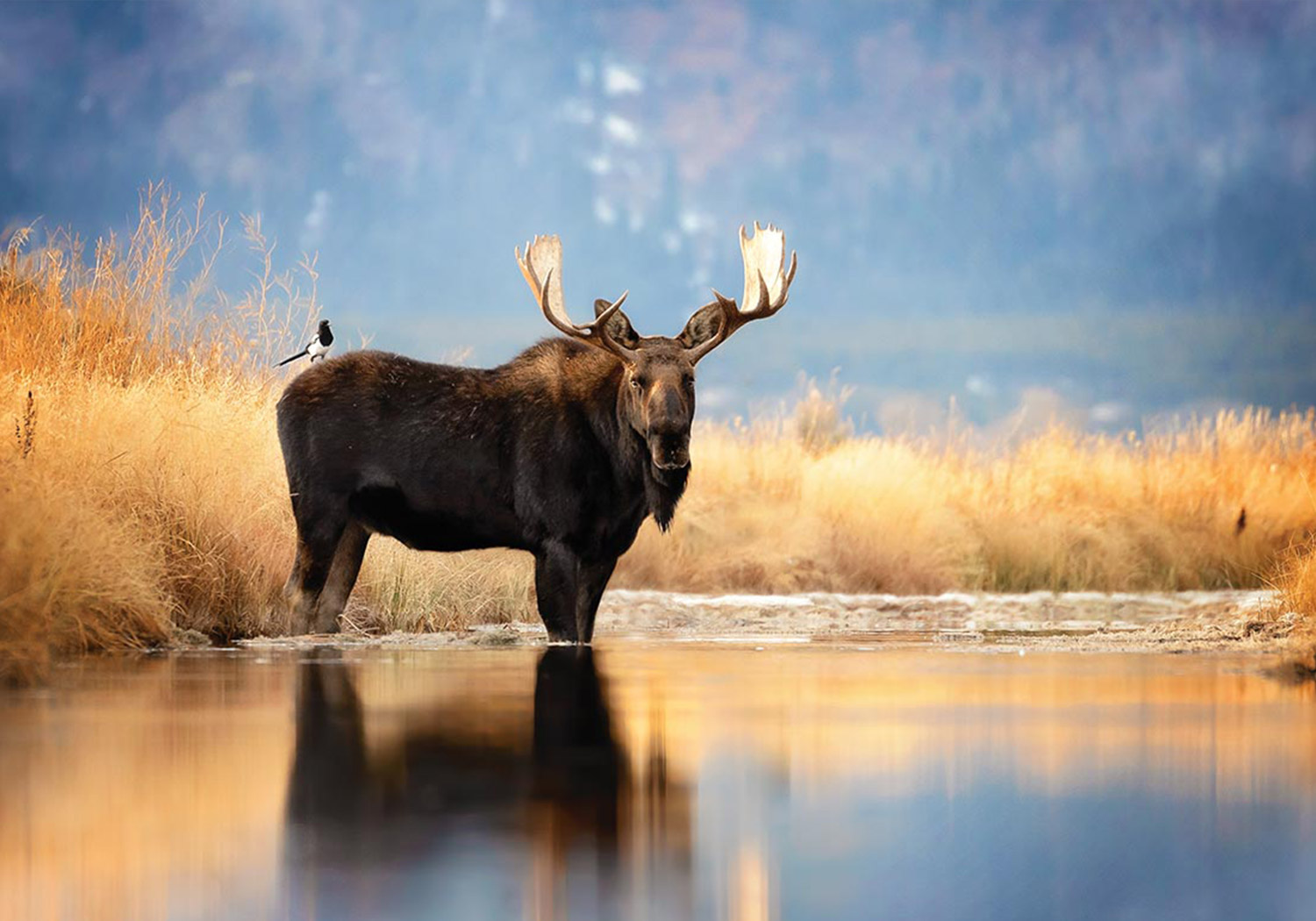
Use the moose, bears, wolves, and field notes to show the patience behind the images.
Bring in my story, experience, awards, and point of view after the work has earned interest.
End with the journal, gear, map, book, social channels, workshops, and contact without turning the site back into a directory.
The new look mattered. The bigger change came from deciding what stayed, what moved, and what no longer needed a page of its own.
Every section had to move the same story forward. If it could not explain why it belonged, I cut it, combined it, or moved it somewhere else.
The interface could add rhythm, but it could not compete with the mountains, the animals, and the field work that give the brand its reason to exist.
The site could get shorter without losing its voice. I kept the field details and the slower pace. I cut the repeated setup.
I reconsidered image crops, type, carousel controls, spacing, card order, and reading length for a phone instead of shrinking the desktop page.
One continuous page now connects the Tetons, the photographs, the animal stories, the person behind the camera, and the work still ahead.
The visual design grew richer while the site structure got smaller. That kept the page from feeling empty or overloaded.
03 Build
I wrote, designed, and built the page as one system. When the story ran long, I could cut it. When a photograph needed room, I could change the layout. When a desktop idea failed on a phone, I could fix it in the code instead of explaining it away.
I listed everything, found repeated setup, separated the portfolio from the wildlife planner, and removed the sections that had stopped earning space.
I set a simple order: place, work, animals, person, journal, then the projects still taking shape.
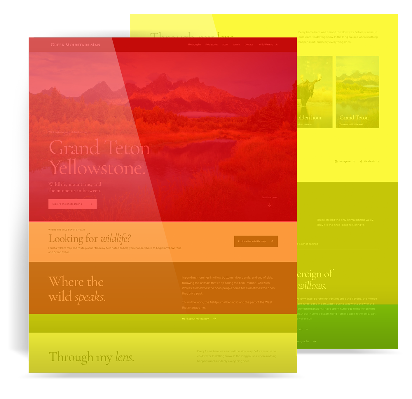
The wireframe set the size and order of the big moments: hero, proof, portfolio, story, biography, supporting content, and contact.
Large serif type, quiet labels, dark field colors, restrained cards, and layered images gave the site character without putting the interface in front of the photographs.
The portfolio and animal stories needed movement without feeling like a stock slider. I built custom controls, image framing, and responsive behavior around the work.
I tuned section changes, image loading, spacing, type, menu behavior, touch controls, and mobile order until the page held together from the first image to contact.
Representative reconstruction
I rebuilt the planning logic in the same clean wireframe style used across these case studies. It shows the decisions that mattered: a strong opening, the work early, proof that does not interrupt, room for the animal stories, and a controlled path to the map, book, workshops, social channels, and contact.
The goal was not to cram everything onto one page. It was to decide what deserved to stop the scroll.
A one-page site still needs rules. Without them, it becomes a stack of nice-looking sections. I built a repeatable rhythm that could hold different kinds of content without losing the main story.
The opening brings together place, voice, proof, and two clear paths without turning the first screen into a menu for everything.
The photographs stay large. Controls, captions, sequence, and links stay easy to find and use.
Each animal gets a visual sequence, a specific story, and a line from the field without needing a separate long page.
My story, years in the field, awards, publishing, and experience support the work after people have seen why they matter.
The journal, gear, book, map, workshops, social channels, and contact use tighter patterns so they support the story instead of starting it over.
Custom HTML, CSS, and jQuery run the layout, carousels, layered visuals, and responsive details inside WordPress.
Mobile composition
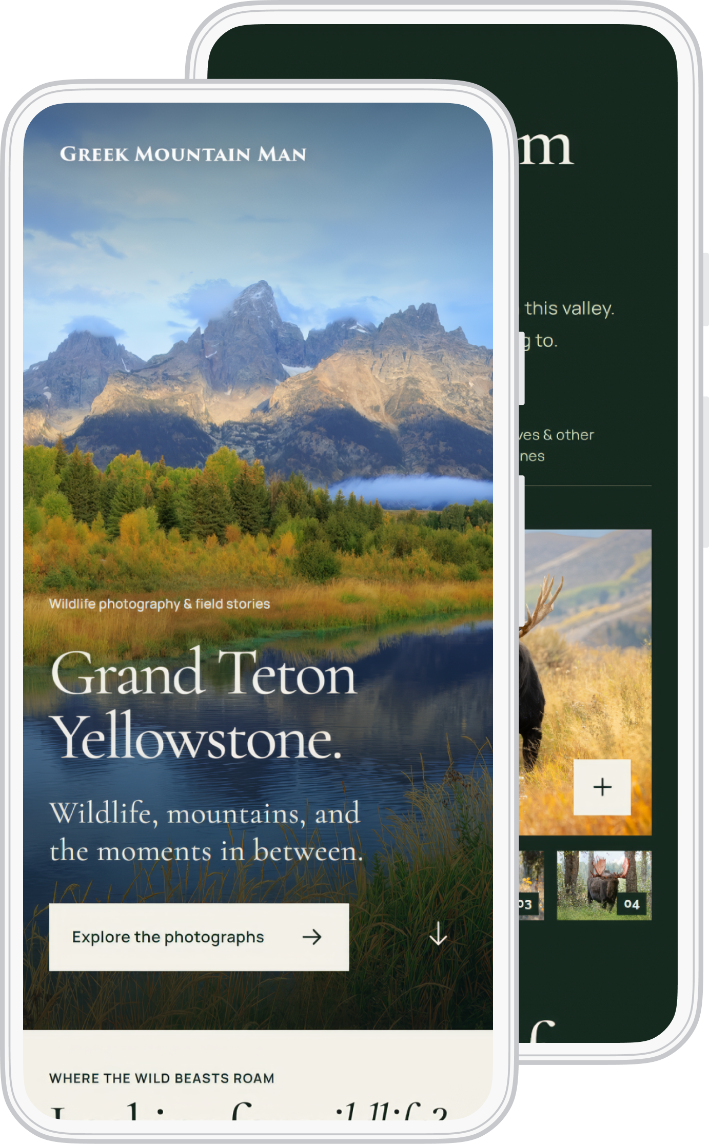
The site is long and image-heavy on purpose. On a phone, I had to control what showed first, how much copy appeared at once, where images cropped, how carousels moved under a thumb, and when each supporting section had earned the next screen.
04 Edit
Cutting a personal project is hard. Every page carries a memory, an idea, or something you still hope to build. The site got better when I stopped asking whether a section was good and started asking whether it helped people understand the whole thing.
They are the reason the brand exists. They earned size, time, strong images, and room for the writing to slow down.
They build trust, but they do not need to interrupt the story or become pages of their own.
They still matter. They work better as connected chapters after people understand the work.
The map solves a different problem and needs its own product. The portfolio can introduce it without trying to hold all of it.
The site did not get shorter by losing detail. It got shorter by giving detail a place. Big moments carry the emotion. Supporting sections answer practical questions. Future projects arrive after people have a reason to care.
These rules keep the site from growing back into the thing I just fixed.
A section stays only when it gives people a new reason to continue. Repeating the brand in different words is not enough.
Let the photographs earn attention first. My story and credentials then explain the years behind them.
A good idea can be a strong section, card, or link. It does not always need another page in the menu.
The map, book, and workshops can stay visible without letting unfinished work take over the site.
05 Outcome
I am not claiming a made-up conversion lift or a lab-style before-and-after test. The win is visible in the site itself: fewer pages, a stronger story, a better phone experience, and a site I can actually keep current as Greek Mountain Man keeps changing.
1 page
Core experienceThe main story now lives in one clear flow instead of asking people to piece it together across a large site.
Clearer
Narrative hierarchyThe place, photographs, animals, person, and future projects now arrive in an order that makes sense.
Stronger
Phone compositionThe long scroll was rebuilt around image crops, touch, reading length, controls, and pace.
Lighter
Maintenance burdenFewer pages make it easier to keep the site honest, current, and tied to the work that actually exists.
The page now starts in the field, shows the work, explains why I keep returning to these animals, and gives enough of my story to make the rest make sense. From there, people can find the map, book, journal, social channels, and future workshops. The site is smaller. The world behind it feels bigger.
People can understand the place, the person, and the point of view without opening five pages or reading a long brand pitch.
Large photographs, quiet interface details, and different section pacing keep the long page from turning into the same grid over and over.
The phone keeps the landscape, story, photographs, and controls without dragging every desktop choice along with it.
The map, book, workshops, journal, and new work all have a place without pulling the portfolio back into a scattered site.
My contribution
Because this is my own brand, I owned both the mess and the fix. I made the content, design, code, and maintenance choices together. This was not a concept piece.
The finished site holds the photographs, field stories, animal encounters, experience, journal, gear, map, book, workshops, and contact inside one focused experience. The method is the same one I bring to client work: know what the page needs to do, cut what gets in the way, build a clear path, and stay close enough to the code that the idea survives.